Is the boom of illustration in tech all quantity, no variety? This week: the roots and risks of visual monoculture. Why do trends catch on and how do we rise above them to create truly unique voices?

Show notes
Today’s guests:
Recommended reading:
Two Very Different Kinds of Illustration and Illustration in the App Store
Khoi Vinh’s two articles that form the backbone of this episode. The former compares the diversity of style and expression in editorial illustration with the apparent monoculture in tech illustration. The latter looks at Apple’s editorial approach in the new App Store.The Year in Illustration 2017 & 2018
Annual retrospectives of illustration in The New York Times. The 2017 edition was the impetus for Khoi’s article.
Transcript
Mark
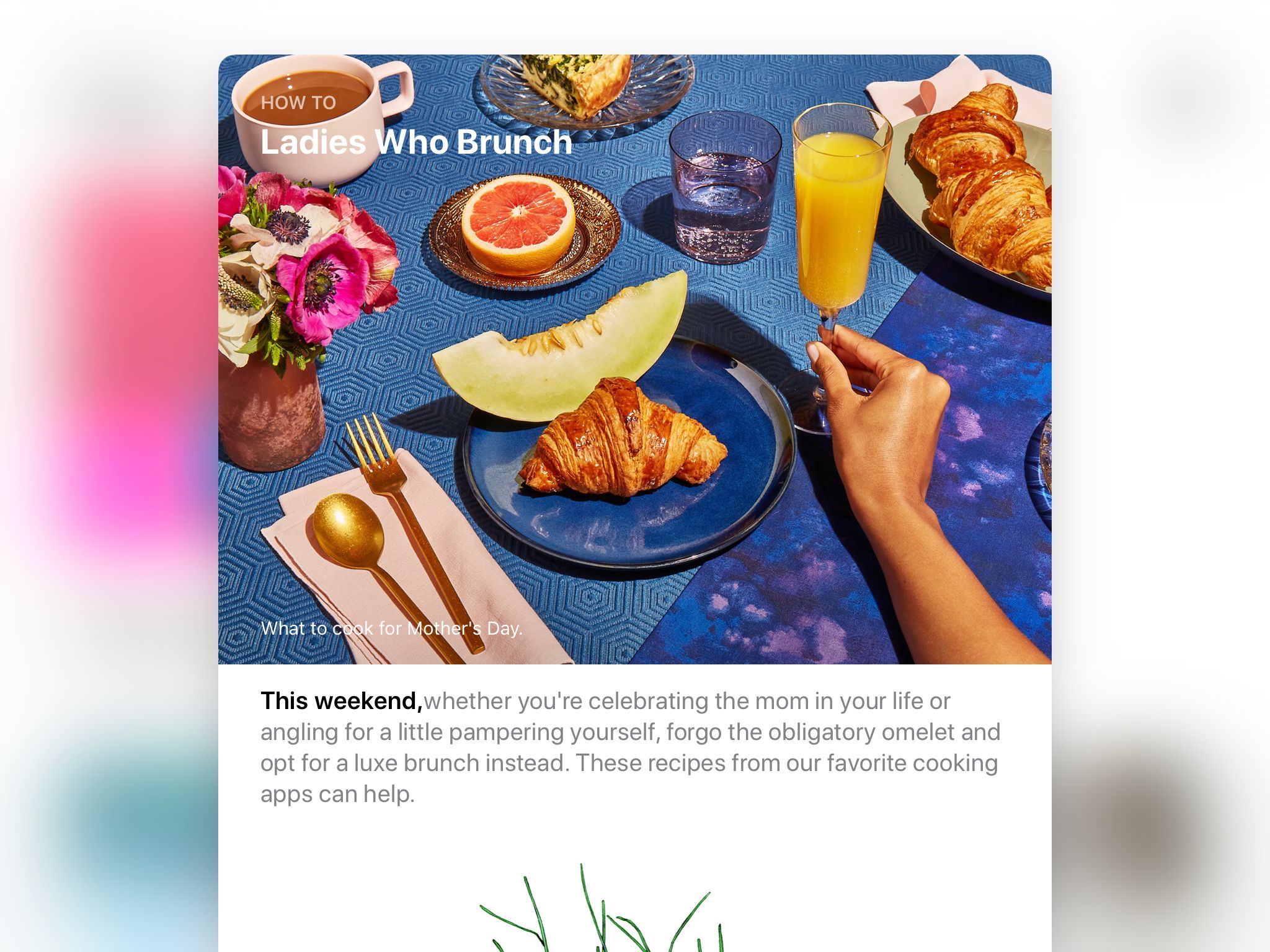
Every December, the New York Times publishes a retrospective on its use of illustration over the past year. What began over a decade ago as a simple slideshow highlighting a couple dozen favorites from the op-ed pages has since evolved into a full blown feature, a compelling exploration of the state of visual communication at that moment in time. The 2017 edition caught the eye of Khoi Vinh.
Khoi Vinh
Hi, I’m Khoi Vinh, principal designer at Adobe.
Mark
Khoi, who served as design director of The New York Times Online from 2006 to 2010, was struck by the profound creativity and intellectual depth of the work. In an article on his long-running blog, Subtraction.com, Khoi marveled at the depth of expression, breadth of style, and variety of media, with illustrations created in, quote, “watercolor, pencil sketches, vector drawings, collages, cartoons and more, plus almost every hybrid of the above.”

Dozens of incredibly diverse approaches to depicting a single subject, as seen in The Year in Illustration 2017.
That richness brought Khoi’s mind to another place rife with illustration.
Khoi
I’m not sure I can point to a specific day or week or even month where I realized that the illustrations that I was seeing from technology companies were all following the same approach, which was very geometric, very vector-based, very flat, very anodyne. There’s a lack of texture, there’s a lack of grit, there’s a lack of human mark-making. It’s just something that dawned on me over time when I saw it again and again and again.
Mark
There’s a ton of illustration in tech these days—that’s the point of this podcast, after all. But is Khoi right? Is it all quantity, no variety? One visual voice to rule them all? And if so, why? How’d that happen? Let’s find out.
My name is Mark Grambau, and you’re listening to How to Draw a Startup: A step-by-step guide to illustration in tech.
[Theme music]
Mark
Step 5: Stand out.
Khoi
I’ve been thinking about this trend, I would say, for at least two years before I said, “You know what? I should start capturing some of these examples to really make sure one, that I’m not imagining it, and two, that if I’m correct, that I can actually make this case. I can actually argue that this is something that’s been happening, maybe help some people get a bigger picture view, get more context, and see the trend more viscerally.
Mark
Khoi started collecting examples on a Pinterest board.
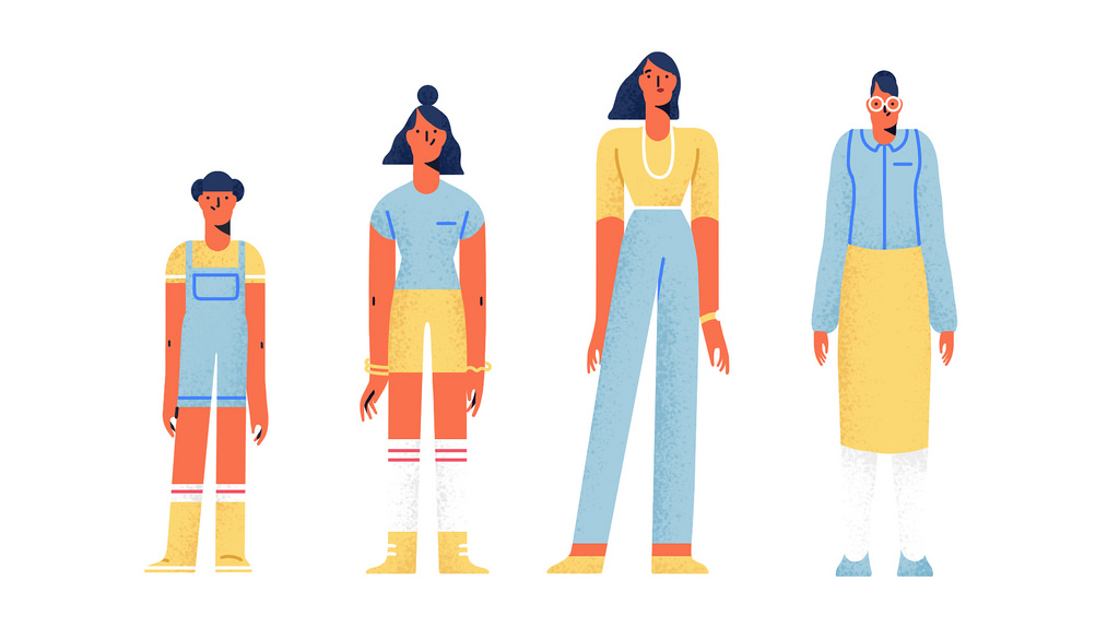
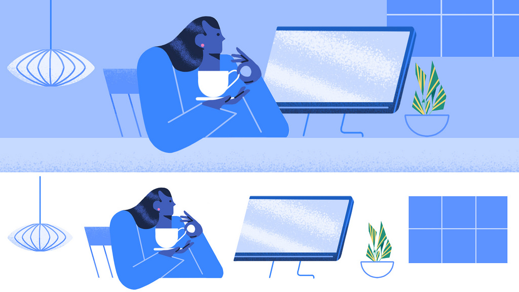
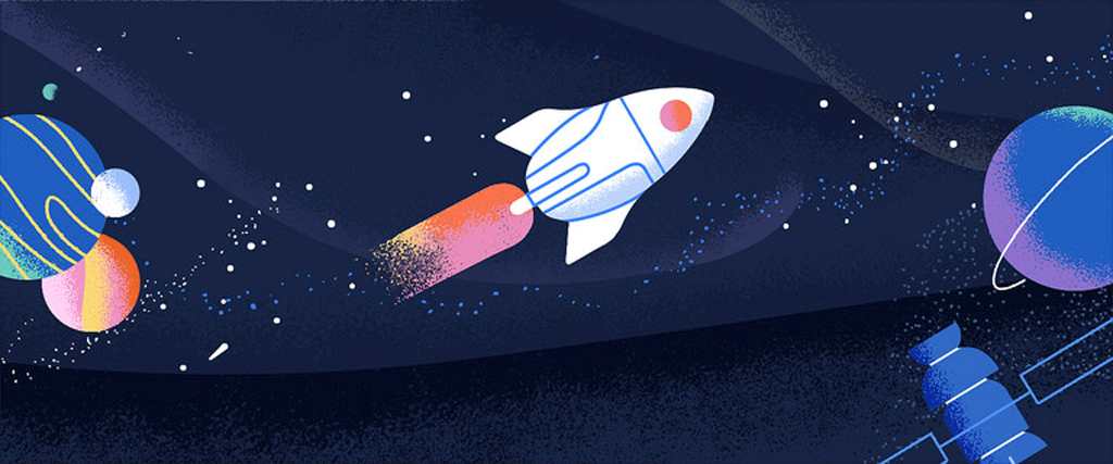
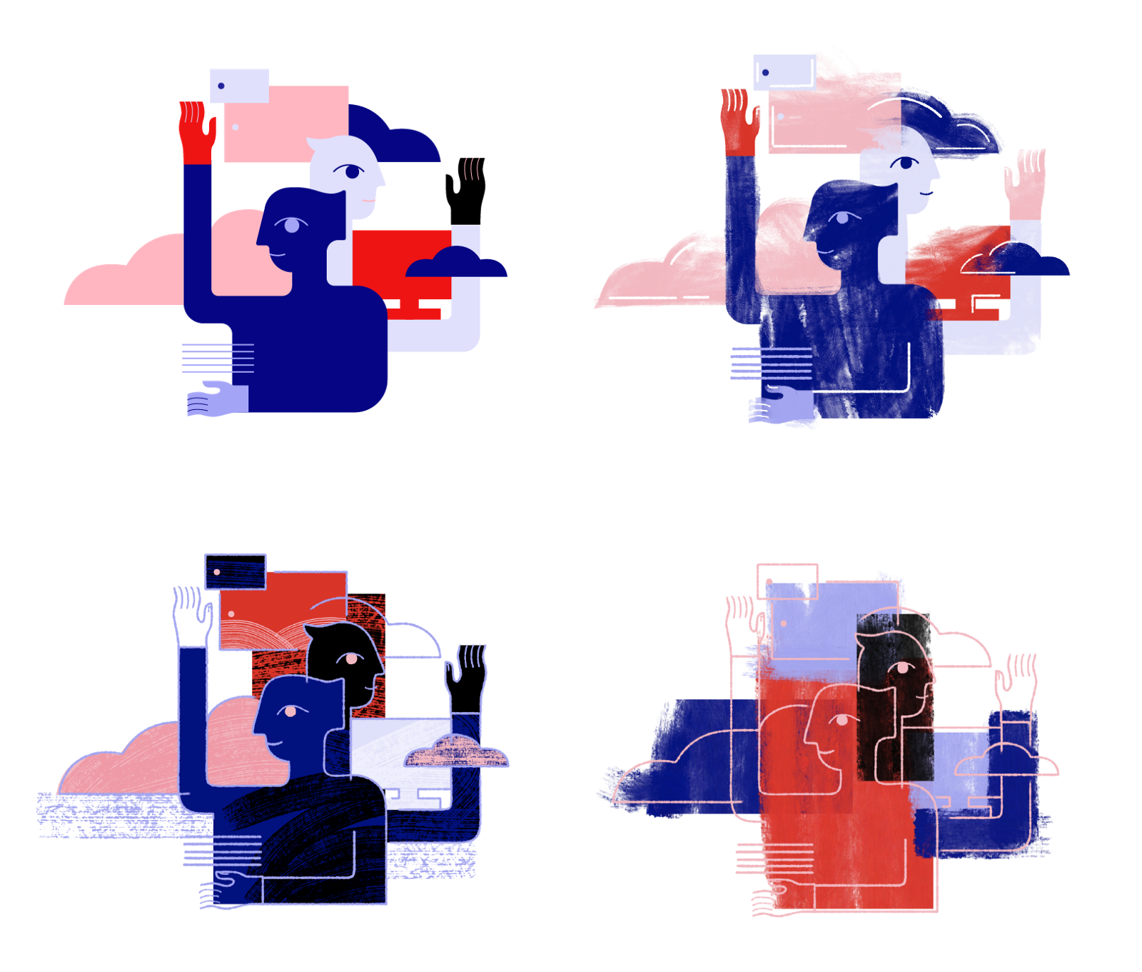
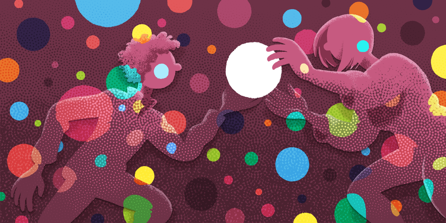
He found dozens of illustrations that all seemed to live in the same visual world despite coming from vastly different companies, big and small, like Google, Oscar, Box, Eufy, Skillshare, and InVision. In Khoi’s words: a monoculture.

Khoi Vinh noticed a number of tech companies employing a similar approach to illustration.
Khoi
The reason I use the word monoculture in that article was, frankly, to be a little bit provocative. To imply that the trend, this set of aesthetic characteristics that had really caught on with a lot of different companies or had become an accepted way of communicating, that that approach had become so popular, so pervasive that, in effect, virtually every technology company was choosing to communicate through that visual language.
Mark
Provocative or not, was he right? Did other designers and illustrators notice the same pattern, or was Khoi cherry-picking?
Kristen Spilman, who began her career in design education, branding, and identity, noticed an aesthetic echo chamber as soon as she arrived in Silicon Valley. In particular, she recognized the influence of Dribbble, the design community where creatives post snapshots of their work, as well as “rebounds,” visual responses to and remixes of each other’s images. It’s a vibrant network of inspirational imagery that I love participating in, but that fundamental structure of snippets and remixes has shaped it culture and earned Dribbble a bit of a reputation as a community that values glossy pixel perfection, but often at the expense of context and real-world design constraints.
Kristen Spilman
I was shocked when I got to Dropbox and saw that, like, that’s where so much inspiration and reference came from. And it’s amazing to a certain degree in terms of the community that’s built out there, but also incredibly damaging in terms of authenticity and originality of ideas, right?
I always tell people, like, “Stop thinking that you’re going to find an original idea. Everything’s been done before.” So it’s not necessarily about originality, but it is important to have original thought and to build off of that. And Dribbble—or sources where people are just kind of pulling from the same place—it has a really interesting effect on on the world.
Mark
And just as the Dribbble community influenced Dropbox, Dropbox’s approach to illustration influenced the broader tech landscape, as we discussed at the end of the first episode.
Kristen
The the monoculture is a thing, the struggle is real, I’ll say that. And I’ve seen it, you know, from the inside. And I’ll point to a Dropbox example: Ryan Putnam, to a certain degree, can be credited with creating space for illustration in tech, at least, like, the power and the potential of the role that illustration has. And he is just such an amazingly talented person, and his work shows, and it’s copied left and right.
Mark
Of course, the imitation, inspiration, and copycat culture isn’t limited to one social network or company or even illustration. The tech industry isn’t all “innovation” and “disruption.” It values efficiency and best practices. If a certain look or page layout or app design is working for that company, why should we reinvent the wheel? A thorough brand exploration process may produce something tailor-fit, something special, unique. But it’s also risky.
Kristen
So there's many factors that are leading to the result of monoculture, right? But when you're seeing something that seems to be clearly successful for “X” product, and it's somewhat formulaic and understanding what they did to build that out, let me try that too with a slight little tweak.
Mark
Trends get around not just because they’re attractive, but because also because they appear proven—and therefore safe. In the case of illustration, neither Khoi nor any of my other guests attribute this to outright malice, an army of unscrupulous illustrators lifting each other’s work. No, Khoi points to how illustration itself came to the tech industry.
Khoi
It’s kind of indicative of the relationship between technology and illustration. It’s very often a case of, “Well, wouldn’t it be nice to use illustration? We don’t really want to have to pay a real illustrator for this. If there’s somebody on staff who can do it, let’s just use this, you know, the on-staff… the person is already getting paid for doing something else. Maybe we’ll pay him or her some nominal amount to do some extra work in the illustration realm.”
And I think that’s a common story for how illustration has been used at technology companies for the past decade or so, unfortunately.
Mark
This idea was echoed by Jennifer Hom who, as we learned in the last episode, was the first Google Doodler with an actual education in illustration.
Jennifer Hom
Also something that is contributing to a singular aesthetic in tech illustration is that it just isn’t staffed that well. And the way that like illustration has evolved in tech was, “We don’t have an illustrator. We know that we want illustrations. Get this person to do it.” And this person is usually, like, a designer or an engineer.
Someone just had a style that was acceptable for people who weren’t trained in illustration. The rest of the company saw it, they adopted it. Other tech companies saw it, they adopted it. It was just, like, a lack of staffing and a lack of funding for illustration that’s contributed to this, like, cycle of monoculture. No one is an expert and able to push the needle, so it’s been kind of the same for a while.
Mark
In his article, Khoi brings up another side of the inexperience argument. The style itself is indicative of a common production process. He writes, quote:
They can all be executed with the tools that a designer has at his or her disposal—a vector drawing app and an image editing app. There’s none of the unexpectedness that editorial illustration prioritizes and that professional illustrators spend years mastering—no photostats, no Rorschach patterns, no sculptures, no halftones, no unruly blotches of ink or paint.
Khoi has a fair point, but if we’re going to talk tools and technical processes, I want to take a minute for my listeners who don’t live their lives inside graphics applications and make sure we’re all clear on two key vocabulary words: “raster” and “vector.”
First, think of your computer or phone’s screen. It’s a grid, and everything you see—windows, words, images, video—it’s all just a bunch of squares—pixels—each filled with a different color.
Now, imagine I want to show a circle on screen that’s 100 squares across.
A raster graphic is an image file that, like your screen, is made up of a grid of a fixed number pixels. To make my 100 pixel diameter circle, imagine my file as a sheet of graph paper, each side 100 squares long.
I start filling in squares on the graph paper. I can’t make half squares. Each square is either full or empty. Coloring in the middle of the circle is easy, but the edges… I can’t make them perfectly smooth, no matter what I do. I follow the curvature of a perfect circle, but the squares aren’t small enough. The edges are inevitably sort of jagged. To compensate, I make some of those edge squares a lighter color or even translucent. If I step away far enough, those individual squares seem to disappear, and I see a nice smooth circle.
Rasters are great for photographs, complex textures, and reproductions of the analog methods that Khoi listed like collage and splattered ink. On the other hand, rasters are inherently limited in terms of scaling. This is because the file is limited by the size it started at—in the case of my circle, the 100 by 100 square sheet of graph paper. I can’t just invent new image data when it gets bigger, as anyone who’s ever taken a digital photo knows. Zoom in or blow up enough, and you’ll always see the pixels, the jagged edges. This isn’t CSI, I can’t take a photo of a big crowd, say “enhance!” and turn four measly pixels in the corner into a perfectly recognizable face.
Vector graphics, on the other hand, are infinitely scalable. They’re effectively math equations, precisely defined lines and curves along a series of coordinates. To define my circle, I don’t color in squares. I use a compass. I set it to my preferred radius, 50 squares, set the pin down, and I spin. A perfect circle.
I can swap out “radius equals 50 squares” with “radius equals 50 inches” or “100 feet,” for that matter. Because the file is just a bunch of rules about the construction of a shape, my circle will always be as sharp as the screen its shown on or the billboard its printed on allows. This makes vectors a poor fit for texture and photography, but absolutely perfect for typography, logos, icons—graphics with clean, clear shapes and curves that need to maintain precision at every scale.
Jennifer Hom, like Khoi, recognizes that much of tech illustration is built with vector graphics, but she draws a different conclusion. She points out that, in many cases, vectors are a functional necessity.
Jennifer
There are real technical restrictions, first of which is that editorial illustration lives in essentially one or two places. It is in a fixed location with a body of text. It doesn’t have to move, it doesn’t have to resize. It’s either on the website of, like, the New York Times, or on print, and it doesn’t go anywhere else.
Tech illustration, though, has to scale. It has to go across devices, it has to go on desktop, on mobile, native app, web mobile, billboards, buses—it has to be everywhere. So it has to be in vector.
It also has to comply with the engineering team. So, like, the way the app is built, they’re probably going to want to ship specific file types. Not a print, not a JPEG, they want SVGs.
Mark
SVG, by the way, stands for “Scalable Vector Graphics,” a common vector file format.
Jennifer
So you have color restrictions, you have medium restrictions. These are things that are necessary to even get these things alive in the product. So you have to use vector, and that’s just the way it is right now.
Mark
If vector is a necessity, she believes breaking up the monoculture requires more trained illustrators to learn to produce vectors.
Jennifer
It’s just another medium, it’s not going to restrict you creatively. It’s going to dictate the foundation of your illustration, to a certain degree. It’s going to force you to think about what you’re designing. Every piece of what you design has to be thought of in vector. But it’s very powerful because it can live in all these different use cases.
I want more illustrators—proper, trained illustrators—to learn the medium necessary to break into this industry because we need more perspectives, we need more opinions, we need more interpretations. It’s just a matter of medium.
If you can do vector, bring your perspective and your skills and your insight to this industry, because it is definitely needed to break up the monoculture.
Mark
Now, for all this discussion of technique and tools and aesthetic, it’s important we not overlook concept and context.
Khoi
I think at some point it’s worth emphasizing that illustration for editorial is very different from illustration for products. They really have two different aims and it’s not exactly fair to compare them.
Mark
Over the last four episodes, the role of illustration in tech has been discussed ad nauseam. It humanizes, demystifies, motivates. But illustration has a different job in an editorial setting. For a better understanding, I turned to one of the folks who taught me what illustration was in the first place.
Allan Comport
My name is Allan Comport. I am currently the chair of the illustration department at Maryland Institute College of Art in Baltimore, Maryland. I’m also a professor teaching a number of classes in the illustration department. I’ve also taught in the art history department there.
Mark
Before landing at MICA, Allan spent decades in the industry. He and his wife, Sally Wern Comport, a highly accomplished illustrator, have run several successful creative businesses, and Allan also spent years as an artists’ rep. I had a long, wonderful conversation with my old professor which you’ll hear plenty more of in a future episode, but here’s a sneak peek:
Allan
James McMullan, a great illustrator out of New York, always talked about when you do editorial, you just don’t read the article and illustrate the article. You read the article and then bring some new thought to it, bring some new vision, some new idea, some new perspective to it that you’re bringing. What are you contributing to this article? And so I think that’s for all of us. That’s for the illustrators, photographers, and certainly for the design directors, creative directors, and art directors to also say, all together, “What can we do to move this ball creatively further than we thought we needed to?”
Mark
Remember Jennifer Hom’s lesson from the end of Step 4, “No bummer Doodles?” Product and brand illustration is largely there to celebrate, to amuse, to comfort. To grease the gears and move the user towards an action.
Editorial illustration is often called upon to do the very opposite. It can challenge the reader, stop them in their tracks, and cause them to reflect on any number of emotionally complex concepts: pain, love, loss, discrimination, exploitation. Of course the palette is wider. Of course the range of expression is deeper.
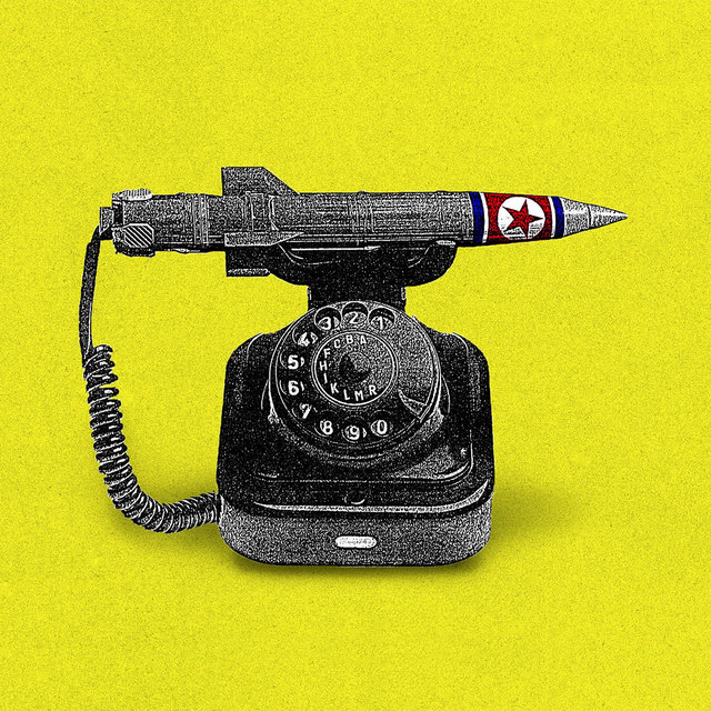
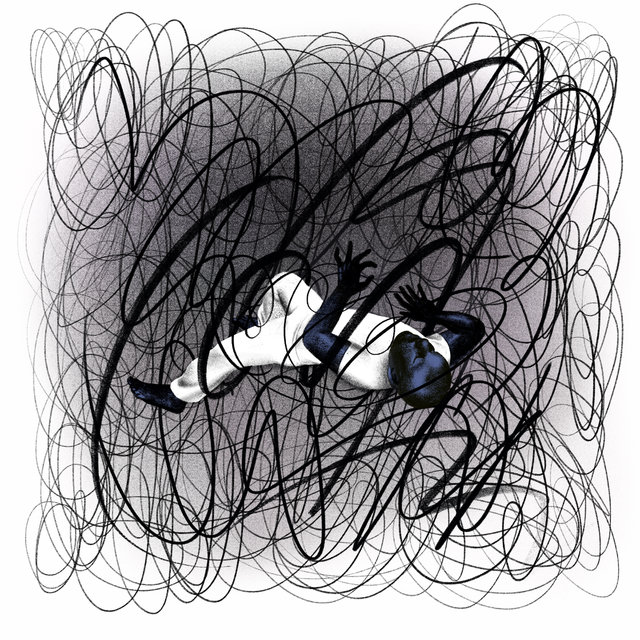
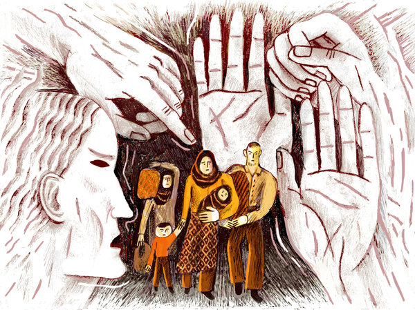
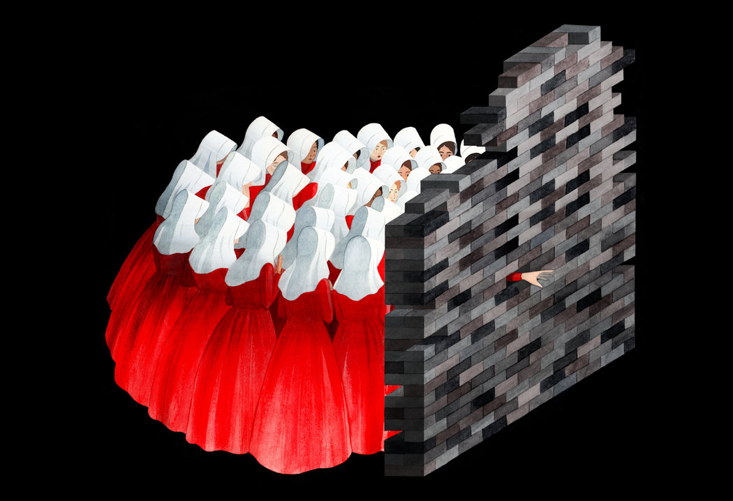
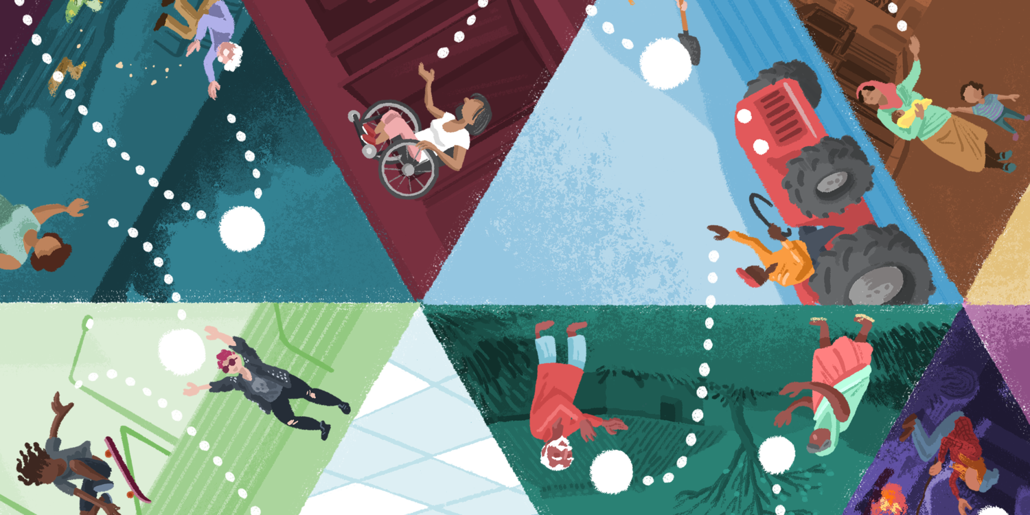
A handful of editorial illustrations featured in The Year in Illustration 2017
Khoi knows this; he’s worked in tech and in journalism. Still, he argues, a limited range of emotion need not mean a limited range of execution. After all, as technology expands further into every facet our lives, the breadth of problems it seeks to address expands as well.
Khoi
The question is: At what point does the value become commoditized? And at what point does the lack of distinctiveness, the lack of unique voices really start to hurt the company themselves and also hurt the community of users and customers?
I mean, if you’ve got a wide range of apps and services—you know, everything from ride hailing to apartment sharing to recording your physical and health data—if all of these services speak in the same language, are you essentially talking to one kind of user out there? Or one kind of customer? Or maybe effectively excluding other people? Or are you missing opportunities to make your brand, your company, your service distinct from the others? Ultimately, are we all just limiting the the use cases that we solve for? Limiting the problems that we’re trying to tackle?
And I’m exaggerating a little bit here about what the outcome is of these kinds of aesthetic choices, but if you look at how technology has chosen to apply itself over the past decade, the kinds of problems that technology has applied itself to, it’s actually no accident that this kind of illustration caught on. It’s very anodyne. It’s very benign. It’s not very challenging. It doesn’t really seek to address a wider worldview, doesn’t seek to acknowledge diversity in the audience that it’s communicating to. And that matches up to the kinds of apps and services that we’ve seen over the past decade or so, where, you know, you have services devoted to getting your laundry done or getting alcohol delivered to, you know, your condo. I mean, basically services that are oriented towards treating customers as, you know, privileged children.
Mark
Thankfully, nothing is ever truly stagnant. The last few years have seen some promising new approaches to illustration in tech. For one, traditional thinking around using and producing vector graphics is, in some instances, being rethought.
Kevin Walker’s team at Buck wanted to capture a textural, natural feel with their “Alegria” illustration system for Facebook. At a glance, the work looks like vector—clean curves, bold shapes—but upon closer inspection, one starts to see shadows and highlights that appear to be painted on. You see the uneven edges of a dry paintbrush. I asked Kevin how the illustrations were produced.

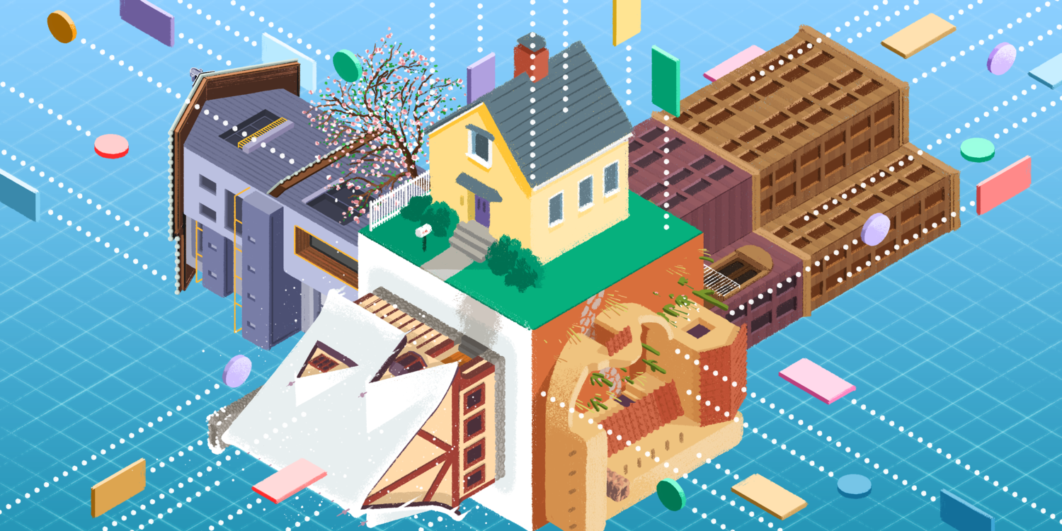
A handful of textural illustrations from Buck’s Alegria illustration system for Facebook
Mark (in interview)
Are those textures that, going through there, are those vector brushes within vector illustrations so that they can scale? Or is this a mixture of vector and raster?
Kevin Walker
I feel like you’ve hit a million dollar question here. [laughter]
Okay, so: the great saga of texture.
Now, I think texture is incredibly important in terms of keeping an illustration feeling relatable, going back to that idea of mark-making. And so when we started ideating, when we started coming up with different styles, we were entirely in Photoshop. And so this idea of vector—something living without scale or without resolution—really was not important.
And, you know, I think that that probably is also why it seemed so attractive, because it was breaking out of this vector look. And it got traction and then we had to solve. How do you do texture? How do you do this idea of a brush in Illustrator? In a vector program? And I guess there’s two things here, and I’ll explain to you, like, how we got to the final solve. But there’s also the question of “Do companies need…” (and this is just, like, a question I’m going to leave out there into the ether) “Do companies actually need things to be vector?”
You know, I know there’s the way it’s always been done, and there’s this idea that if you are working in things that really are built from the ground up as vector applications, you think that everything should be vector, if you’re working in Sketch. But is there some reason why illustration needs to be treated differently from photography, which no one would ever expect to be vector? And I think it’s a good thing for companies to think about, because when you suddenly think about that, you think “Well, I have no problem dealing with assets that, you know, are films or photographies or from film shoots that actually have a resolution and a scale and they are what they are. So why does the illustration need to be treated differently?” Just leaving that out there to be digested.
Now back to working on the Alegria and coming up with a solution. We went and we created these brushes that we were using in Illustrator. It was incredibly laborious, using all sorts of smart trickery with transparency, masking, and the rest of it so that there is opacity to these brushes depending on the stipple, and all of this stuff that made it a really huge technical ask. But they now live, sort of as vector brushes, and so you can, as an artist, you can stroke across something and it will drop down this brush that looks pretty unbelievably like it could not have come out of a vector program, but it does.
The downside of really going after that type of stuff in a vector program, is that vector programs are not built for that level of detail, and so they get really slow very quickly. And so that, you know, to this day, there is still that tension in Alegria of working with the textures, the files, the images getting unworkable. And how do you resolve that? And so, often at the beginning of any ask, they they need to know quickly, like, “Can I just do this as a raster or do I have to do this as a vector?” Because, like I said earlier, I don’t think that there should be as much of a expectation that illustration needs to be done as vector.
Mark (as narrator)
Kevin’s team and their illustration system for Facebook aren’t alone. Dropbox, Mailchimp, and Adobe have all undergone recent rebrands that adopt a looser, more textural illustrative style. They’re all emphasizing the presence of the artist’s hand.

Kevin
You know, it goes back to the idea that illustration really is a direct communication. Might as well show off that, like, not everything is totally clean and buttoned up. There are actually people that are making these things. You know, illustration can be really helpful in communicating that.
And, you know, I think this newer iteration of Dropbox illustration style, where they’ve gone with this sort of loose pencil stroke, is about that. It’s about this idea that, like, “We are not just ones and zeros. We’re we’re makers, too, and we’re making this product. And as much as we are a company, we’re also a collection of people.” And I think it’s a great thing to communicate.
Mark
In the last episode, we met illustrator Quentin Vijoux, whose world of animal characters was once the face of Intercom. I described the work as ahead of its time because of Quentin’s approach.
While Kevin Walker’s team used advanced vector techniques to simulate physical media, Quentin’s illustrations embraced traditional tools in a way few others in the industry have, even to this day.

The Intercom homepage during the time of Quentin’s animal-centric brand system
Quentin Vijoux
Well, I often start with my pencil and making some rough sketches like this. Then I scan them, and I only use Photoshop. I also scan some watercolors—some dots and wash textures—so I can reuse them into Photoshop. And then I redraw, for finals, the sketches with classic brushes in Photoshop. There’s no vector at all.
Mark
Quentin’s not against all vectors or vector software. He just believes in using the right tool for the job.
Quentin
And, to be honest, I really, really like Photoshop and I’m not a big fan of Illustrator. Well, I like Illustrator when it comes to draw letters or vector icons, but for drawing things, Photoshop is really, really nice. And as I said, you can just make a spot with with some paintings on your paper, scan it, and you just reuse it like this. It’s really easy.
Mark
Though Intercom has a new look these days, the spirit behind Quentin’s approach is very much alive. According to Stewart Scott-Curran, who led the Intercom Brand Studio for three years, the company’s creative approach reflects its core business principles.
Stewart Scott-Curran
Our mission, I guess, like, as we kind of vocalize it is to make an internet business personal. And, you know, it’s that mission that really drives a lot of the decisions on what we do. And that brand expression that you’re talking about with the animals and the watercolors was, was really an attempt to kind of, like, show some kind of, like, human presence behind the message. And that’s something that’s really continued through to this day.
You know, we’re not super big on some of the trends that have come before, like, the mono line weight, super clean vector style. We’ve never really gone for that. We’ve always kind of gone for something a little bit more organic. Something that looks like it’s been made with human hands, you know? And that’s kind of our way of talking back to the mission about being personal, and about empowering conversations between people, and proper human interaction.
Mark
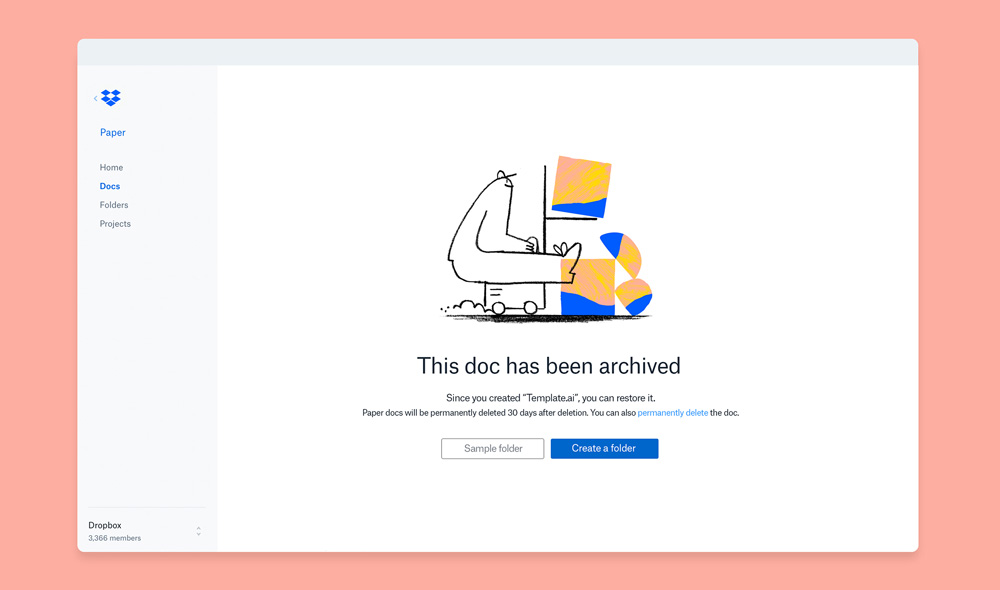
When Stewart joined Intercom in early 2016, one of his team’s first projects was to redesign the company blog.
Stewart
Okay, well, just because it’s a tech company’s blog, it doesn’t have to look like everything else. Why not take a similar approach to illustration and to visualizing editorial as someone like Wired Magazine might do or the New York Times might do? Like, why not work with the best illustrators around?
You know, the writing on the blog is genuinely some of the best in the business, and it does the writing a disservice to have something super bland and kind of expected to accompany it.
And so we work with a lot of freelance illustrators. We do a bunch in-house, too. But for us, like, the key was always to have as much variety as possible. And to have that be something that you’re never quite sure what you’re going to see next, you know?
Screenshots of Inside Intercom, showing their sophisticated editorial approach to illustration. Illustrations by Cathryn Virginia, Frederique Matti, and an uncredited Intercom team member.
Mark
The blog, called “Inside Intercom,” looks, feels, and reads like an industry magazine. The editorial approach means the illustrations are tremendously varied. They’re not just graphics pulled from a pre-built illustration library, and honestly, why should they be?
I pursued this same approach in 2018 when Circle launched a new app called Circle Invest. Invest makes it dead simple to buy crypto assets like Bitcoin and Ethereum. But as part of our mission to bring more people into the world of crypto and blockchain, we knew that an easy user interface was just the first step. We introduced a feature called “Explore,” a collection of original articles published within the app, meant to educate our users on all things crypto—its origins, how it works, and its potential applications.
A few of my editorial illustrations for Circle Invest

After creating a number of icons and illustrations for Invest that all hewed closely to the Circle corporate aesthetic, I saw Explore as a new kind of opportunity. Its goal was to educate and enlighten without feeling like a how-to guide or a customer support center.
I created a unique editorial illustration for each article in a style far more colorful, texturally rich, and conceptually complex than anything else I’d ever produced for Circle. My hope was to elevate the overall experience and bring a new perspective to each story. To turn Explore into a mini crypto magazine within the app.
Now in case you think this editorial thing was just for startups, Khoi Vinh has highlighted another tech company using a purely editorial approach in one of their products: Apple. After a decade of “there’s an app for that,” the iOS App Store had grown to house over two million apps. If you knew what you were looking for, it was passable, but if you wanted to stroll the aisles and discover something new? Forget it. The store was unwieldy, unnavigable. High quality apps were getting lost in the expanse.
In 2017, Apple drastically redesigned the App Store, turning it from a directory into more of a publication, a curated experience to help highlight the store’s many gems. At the center of it all is a new tab called “Today,” a steady stream of articles written by the App Store team. Each post contains one or more graphics—sometimes just a grid of app icons, but more often than not, an original illustration.
Khoi
I’m not a regular visitor to the App Store beyond just going into update when I need to update once in a while, or grab a specific app. And so it took me a good number of months before I realized, like, “Oh, there’s actually some unique illustration going on in here.” Because I would see things occasionally and it didn’t seem plausible to me that the illustrations for a particular story were picked up from the marketing for any specific app. It started to dawn on me that some of these stories were about collections of apps, and the App Store was actually commissioning artwork for the story itself, not for the specific apps.
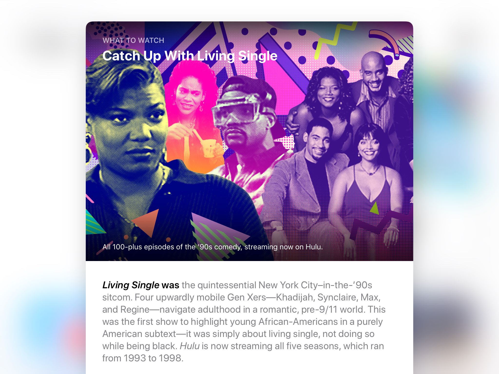
A selection of “Today” articles and custom illustrations from the iOS App Store, collected by Khoi Vinh in his post Illustration in the App Store.
Mark
In a May 2018 blog post, Khoi highlighted the variety of work, from drawing and painting to photo illustration, collage, and animation. In his words:
The sheer variety of styles here is thrilling and as accurate a reflection as any of the app ecosystem. In a sense, this art directorial strategy is a direct, logical extension of the massive diversity of apps available in Apple’s catalog.
Khoi
The overall editorial approach is very beguiling. It’s very effective at drawing my curiosity, and I’ve found a number of really interesting apps that I wouldn’t have found otherwise because they were included in these collections or they got these special write-ups. Overall, I think the the strategy is really successful and very effective.
I mean, you can’t expect Apple to reveal too much just because it’s just not their way, but it would be so interesting to see if there’s statistical data to demonstrate that this has been effective—as effective as I believe it is.
Mark
Of course, not every tech company can apply a literal editorial approach. But to Khoi, the increased range of visual expression and materials and techniques seen at Apple, Intercom, Dropbox, and others is a promising sign for the future for illustration in tech.
Khoi
I think there’s a really clear, strong takeaway from this, and that is that design can do so much more—particularly with illustration—So much more for a company, so much more for a brand, so much more for the relationship between a product and a user. And the way that we’ve been thinking about the limits of what design and illustration can do, up until very recently, has been fairly narrow, fairly unambitious.
And I think that what Apple has shown is that you can be a lot more ambitious, you can be very, very adventurous, and you can expand the definition of what product means by taking on some of the qualities of editorial experience.
I think what other companies like Intercom and Dropbox have shown is that illustration can play a big part in fleshing out what their brand means to customers, and that even if you start at a fairly meager point in terms of using illustration, you can still expand that into something really interesting and distinctive that helps you stand apart.
Mark
Every visual industry will always follow trends to some extent—colors and fonts coming and going like seasonal fashions. But I’m heartened by something deeper: Technology brands are more sophisticated in their use of art and design than ever before. Kevin Walker agrees.
Kevin
Trends, they come and go in six-month cycles, in twelve-month cycles. You know, I think, you know, in the time that I’ve been involved, I can’t count even on all my fingers and toes how many trends have come and gone. And that’s a visual trend.
There’s a second type of trend, which is, like, “Can design communicate in a way that our product on its own can’t? Can design let us reach through the screen and actually make a connection?”
Tech, in particular, has gotten really savvy to that. Their product is not just about the sort of “ones and zeros” or the “What is the functionality?” But it’s also about being able to make connections with their audience, and that trend seems to be on the up and I can’t imagine that that’ll go away.
Mark
This concept is relatively new in the world of technology, an industry built on engineering, silicon, code. For illustration to arrive and thrive, it needed the industry to recognize the fundamental value of design. Without that change, I’m not so sure illustration would have ever found its footing.
So how did the tech industry come to embrace design and user experience? It had to learn from one of its own to Think Different.
[Theme music]
Mark
That story and more on the next episode of How to Draw a Startup:
• • •
Gedeon Maheux
I remember watching that keynote where they introduced Mac OS X and the large 128 by 128 pixel icons—quote unquote “icons” in the dock and on the home screen, and I really thought our careers were over. You know, and we had spent the last four or five years creating 32 by 32 pixel art, you know, with 256 colors, and that was it, you know? We got known for that and we were really good at that. And then Apple comes along and introduces this whole new operating system, and all of a sudden icons are, you know, ten times bigger and they can have millions of colors and they had to all be presented at this angle on the dock, they had to have certain lighting, and all this. I remembers watching that keynote and being scared out of my mind.
Angela Guzman
And they said “Oh, here’s your summer internship project.” And I remember somebody in the background sort of laughing a little bit when they were handing this to me. Like, wow, she’s gonna be busy for three months.
And they’re like, “Do you know what an emoji is?” And I said, “No, I don’t know, actually. I have no idea.” And I felt embarrassed saying that, but I, again, being honest, I was like, “Nope.” And they’re like, “Oh, you know, it’s these Japanese characters that are used in these phones and the carriers, and you’re gonna be drawing, you know, a large set.” And then I realized how many they were going to ask me to draw and that this was my entire project.
• • •
Mark
How to Draw a Startup is written, produced, edited, and scored by me, Mark Grambau.
You can subscribe to the show via Apple Podcasts, Spotify, or wherever fine podcasts are found. And while you’re there, please leave a rating or a review!
You can also find the show on Twitter or Instagram at @drawastartup, or on the web at howtodrawastartup.show.
I’d like to thank my guests this week: Allan Comport, Jennifer Hom, Stewart Scott-Curran, Kristen Spilman, Quentin Vijoux, Khoi Vinh, and Kevin Walker.
Neither my guests nor I speak on behalf of our respective employers.
Of course, you’ve got to check out Khoi’s two blog posts that form the backbone of this episode: Two Very Different Kinds of Illustration and Illustration in the App Store. I’ve linked to them, as well as Khoi’s Pinterest boards, in the show notes. I’ve also linked to The New York Times’ “Year in Illustration” retrospectives for both 2017 and 2018. They are extraordinary, go check ‘em out.
Lastly, if you’re looking for another podcast to listen to, I strongly recommend Wireframe. It’s a show about design hosted by Khoi and produced by Adobe and Gimlet Creative. The first season aired last fall, and it is full of remarkable stories of the unexpected ways design influences—and is influenced by—our daily lives. You can find the show at adobe.ly/wireframe.
All right, that’s all for now. Step 6 is coming February 28th. Thanks for listening!