
A decade ago, the tech landscape looked a lot different. For our inaugural episode, we explore how one young startup's decision to put illustration at the heart of its brand and user experience changed everything.
Show notes
Today’s guests:
Recommended reading:
Illustrating a More Human Brand: The history of Dropbox brand illustration
Written by Michael Jeter, Associate Creative Director & Illustration Lead at Dropbox, this fantastic two-part essay (Part 1 & Part 2) helped inform this episode.The Woman Who Gave the Macintosh a Smile, written by Alexandra Lange for The New Yorker. A profile of Susan Kare, creator of the original Macintosh icon suite.
Transcript
Mark Grambau
It’s the summer of 2008. The Olympics are in Beijing, Senator Obama is on the campaign trail, The Dark Knight and Wall•E are on the silver screen, and I’ve just graduated from art school with a degree in illustration. I wanted to work in my field, but I was convinced, whether true or not, that being a capital “i” illustrator meant being a freelancer. And I knew that I was no freelancer. The lack of external structure, the uncertainty about my next paycheck. I wasn’t cut out for it. Full-time illustration jobs, meanwhile, were scarce, and with the global economic collapse just months away, they’d only become harder to find. I shifted gears, and pursued a career in design.
Suddenly it’s 2018, and the world has changed. Technology has expanded into every corner of our lives and culture, and somehow, illustration seems to have come along for the ride. Technology brands and products are awash with icons, editorial illustrations, avatars, stickers, and of course, emoji. As for me, I lead illustration at a financial tech startup in Boston, a job I couldn’t have imagined a decade ago. And looking around the industry, I’m far from alone. Illustrators are working full-time, in-house jobs at Google, Facebook, and Dropbox, not to mention companies like Airbnb & Lyft that didn’t even exist back in ’08.
So what changed? How did we get to now?
My name is Mark Grambau, and I’ve spent the last year searching for answers, speaking with over a dozen illustrators, designers, art directors, and educators. The result is this podcast, a miniseries that explores why illustration blossomed in the tech industry, how illustrated brands are crafted, and where illustrators fit in creative teams.
Welcome to How to Draw a Startup: A step-by-step guide to illustration in tech.
[Theme music]
Mark
Step 1: Get in the door.
The tech landscape wasn’t always illustrated. In fact, just ten years ago, the web looked a lot different than it does today.
The mid 2000s are often referred to as the “Web 2.0” era. Increased broadband adoption and improvements to fundamental web technologies enabled richer, more interactive experiences like social networks. The web looked friendlier and more people-centric than ever, with colorful, glossy buttons and rich textures.
But bigger changes were on the horizon. The iPhone arrived in 2007 and tablets were just around the corner. We were moving into a new era defined by mobility and constant connectivity.
For decades prior, your Mac or PC was the center of your digital life. Your files lived on your hard drive, and if you needed to take them on the go, transfer them between machines, or back them up, you relied on physical media. First floppies, then ZIP disks, burning CDs or DVDs, external hard drives or USB thumb drives. Hardware all the way down, a model that falls apart in a mobile, multi-device world.

Co-founders Drew Houston (left) and Arash Ferdowsi (right). Image from the Dropbox Press Kit
Dropbox, which was founded in 2007 by Drew Houston and Arash Ferdowsi, rethought the old paradigm, and enabled us to migrate our lives to “the cloud,” a concept that was only just starting to enter the public consciousness.
Dropbox put a folder on your computer that automatically synchronized over the internet. You could install the app on your Mac, your PC, your iPhone, or log in through a web browser, and that same folder would be there, always up to date, always consistent across devices. Dropbox was the first to really nail simple, reliable syncing, the holy grail of a multi-device world. As an early user, let me tell you, it was magical.
But Dropbox wasn’t just a great product. The company also stood out for its embrace of illustration.
While the web 2.0 era was known for friendly facades and shiny buttons, illustration wasn’t really a standard part of the startup branding toolkit. Dropbox was one of the first companies to place illustration at the heart of its brand identity and user experience.
The story of how that happened is what today’s episode is all about. And it begins with a cockroach—or rather, a little sketch of a cockroach, drawn by an early Dropbox employee named Jon Ying.
Kristen Spilman
I'm sure he'll kill me for getting this wrong. But he was somewhere in the range of employee number three to seven, maybe two, who knows. I'm sure I got that wrong, but he was super early, and when you're early on teams like this you wear many hats.
Mark
That’s Kristen Spilman, who joined Dropbox a few years later to lead the brand design studio.
Kristen
John at one point was helping kind of respond to questions and queries and calls that were coming in for the help center. And then he started putting up blog posts for the Dropbox blog which covered a range of topics. But initially, it was like, what is this thing? How do you use it? And one post he made, he had attached a quick pencil sketch.
Mark
Imagine a really simple doodle, looks like it was drawn on a post-it. A stick figure is running, its face angry, brow furrowed, looks like it’s yelling. Over its head, the figure is carrying a Dropbox logo, which looks like a cardboard box. It’s chasing after a cockroach, ready to just squash it to bits. The illustration accompanied a blog post about eliminating bugs in the Dropbox software. Cute, right?

Jon Ying’s original drawing for The Dropbox blog. Images sourced from Illustrating a More Human Brand
This seemingly innocuous cartoon actually sparked some serious debate within the young company. After all, if you’re trying to convince people to trust you with their precious files, don’t you want to demonstrate that you take your job seriously? Would a fun, silly doodle actually turn off customers, erode trust? Or would it show that there are real people behind the product, working hard to make it bug free? In the end, they decided to take a risk on that little bit of whimsy, and they published it.
Kristen
And that post was really popular. I don't know if it was by comments or likes or whatever the metric was, but they started to see a pattern that when illustration was attached to a post, there was much more interaction with that.
And so the illustrations also started to capture a little bit of Jon's personality. It wasn't the personality of Dropbox that was coming through, it was his unique personality. And that's what people were liking.
When you think about this really foreign concept of the cloud, all of a sudden, these sketches were personifying this experience in a way that made it understandable but also had a point of view and was a little bit funny and quirky, and, you know, human things that we could relate to.
And so Jon kind of started illustrating more. And he's not a trained artist or designer, but he's incredibly talented and created a ton of the original pencil sketches that defined the visual language for Dropbox.
Mark
As Jon’s illustrations expanded from the blog to the main website, they became critical tools for visual communication. His joyful, downright silly colored pencil drawings helped explain Dropbox’s features and benefits, without ever feeling like boring diagrams or how-to manuals. Dropbox may have served a utilitarian role, but its brand was anything but.
This approach echoed one of the earliest uses of illustration in tech. When the Macintosh debuted in 1984, it used a graphical user interface to hide away complexity. Instead of typing in archaic commands like in the past, users interacted visually with real world analogies like files, folders, and a trash can, brought to life by Susan Kare’s charming and groundbreaking icons. The system was full of them: a paintbrush, a bomb, a tortoise and a hare for adjusting the mouse cursor speed. Kare’s icons and the metaphors they represented made the Mac friendly, approachable, and understandable.
Jon’s illustrations did the same for the cloud era.
Kristen
These new concepts like “the cloud,” what the hell is a cloud? Is it really above? Is it wires? What do you mean when you say put things in the cloud? So having a visual has been really critical to partner with words to deliver the message in a clear way. A lot of people just don't understand what this text means. And so illustration helps with that.

Isn’t your computer on fire? Image sourced from Illustrating a More Human Brand
Mark
One of Jon's early pieces looks like a single panel newspaper comic. A stick figure sits calmly in front of its computer, which is engulfed in flames. Another figure asks “um… isn’t your computer on fire?” The first responds “It’s okay, my files are saved on Dropbox. It was getting kinda cold in here anyway.”
Jon’s drawings popped up in more and more places, eventually landing in the app itself. Surprise and delight was around every corner. There were dinosaurs, panda bears, eagles, and sharks. Jon drew the DeLorean from Back to the Future, a sword-wielding knight vanquishing a dragon, and an MC Escher-inspired version of the Dropbox logo, which became known as the Psychobox. As a customer, Dropbox felt like this really cool place to hang out.


But as the company and its illustration needs grew, Jon was reaching capacity. After all, illustration wasn’t even his full time gig, he had other work to do. Dropbox’s designers started to chip in. One of the team’s early hires was Ryan Putnam.
Ryan Putnam
My name is Ryan Putnam. I'm a designer and illustrator in San Francisco.
I think like most people I’ve been drawing and stuff ever since I was, you know, super small. Kindergarten, elementary school. I went to a four year college university, not an art school. I was more interested in getting a more rounded education, but I did concentrate in fine art with a concentration in graphic design.
Mark
After working in a few small design studios, Ryan struck out on his own.
Ryan
I was doing that probably for like five or six years, concentrating mostly on like, small business brand design. And again, I had like this other blog that I would write Illustrator tips, tricks, and tutorials. And I think that got me some name recognition within more of the tech space, so I had more friends out here in the Bay Area. At this time I was living in Colorado.
And then, my friend Morgan Knutson reached out to me for a gig with Dropbox. It was doing all the brand work and environmental graphics, everything for Dropbox’s first Developers Conference—first and only [laughter]—but I came out here for three months with my wife and six month old son. I did the three month contract, it was great. They offered me a full time gig so I came aboard with them, and I worked there for probably about a year and a half, almost two years.
Jon Ying was doing a bunch of the colored pencil drawings that were super fun and irreverent. There were other designers doing some illustration work as well. Like Alice Lee was there before doing some work. Allison House was doing some illustration work. Everyone was doing design, too. It was pretty level, everyone was just a designer.

“Your stuff, anywhere.” Illustration by Alice Lee
Mark
With several people now illustrating, the brand began lacking consistency, each drawing capturing its creator’s particular style. As Kristen noted, the Dropbox visual voice had, to this point, basically just been an extension of Jon Ying’s personality.
This wasn’t just a brand clarity issue. In design and illustration alike, the lack of a well-defined style guide means each piece is effectively starting from scratch, both visually and conceptually. And when new team members come on board, it’s hard to articulate how they should approach the work. Thankfully, Ryan’s skill set was particularly well-suited to this problem.
Ryan
I mean, even now, I consider myself probably more of a designer than an illustrator. I would say, I design illustrations, or I design illustration systems. So like, there’s product designers—I’m and illustration designer, essentially.
Mark
Ryan started honing in, piece by piece, on a unified style.
Ryan
And it was kind of trying to tug on some of the strings that Jon has already set in place. You know, irreverent, something that has a hand feel to it, something delightful. So I produced a first style guide for the illustration work that I was doing, which was, you know, like a set of Illustrator brushes, a specific palette, you know, “you have to do things this very specific way.” And then once we got some other illustrators really banging on it like Zach Graham, really filling out the style itself, finding out what didn't work, what worked, then we could really systematize the illustration.
Mark
The style guide was precise. It treated illustration in the way brands treat logos, typography, and photography. “Use this kind of stroke with this particular weight. Use only these specific colors. No gradients. No patterns.”
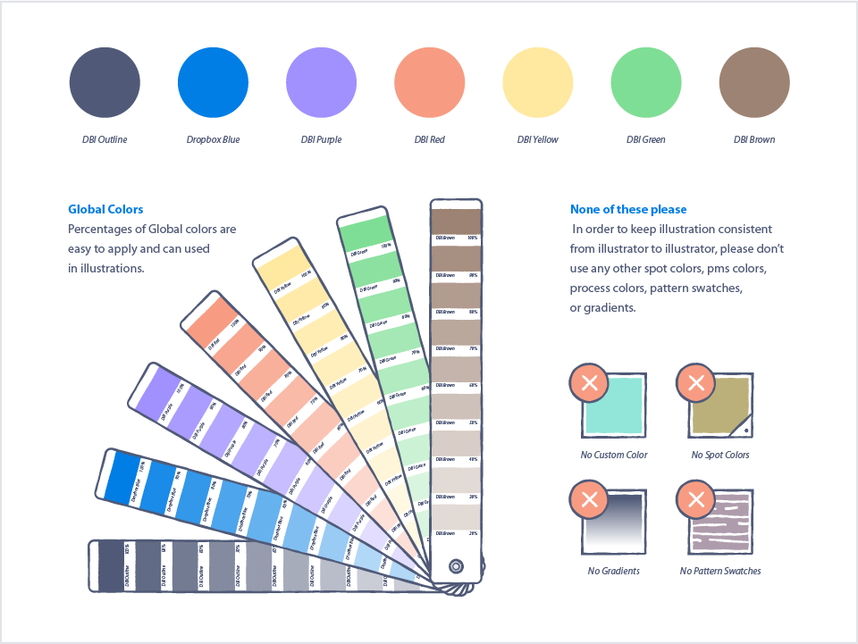
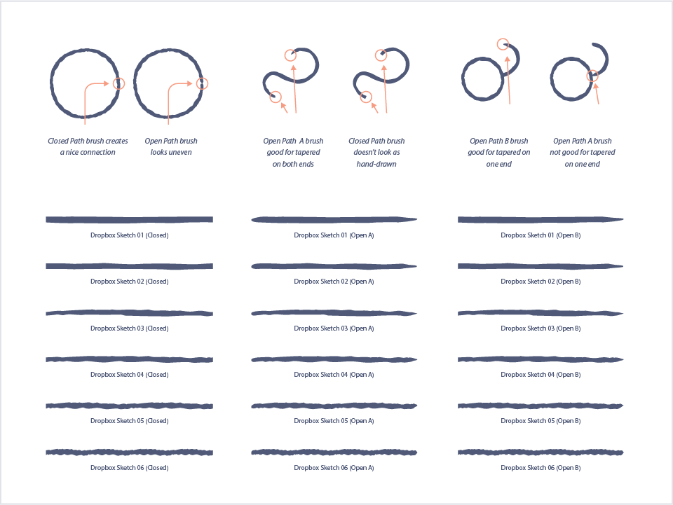
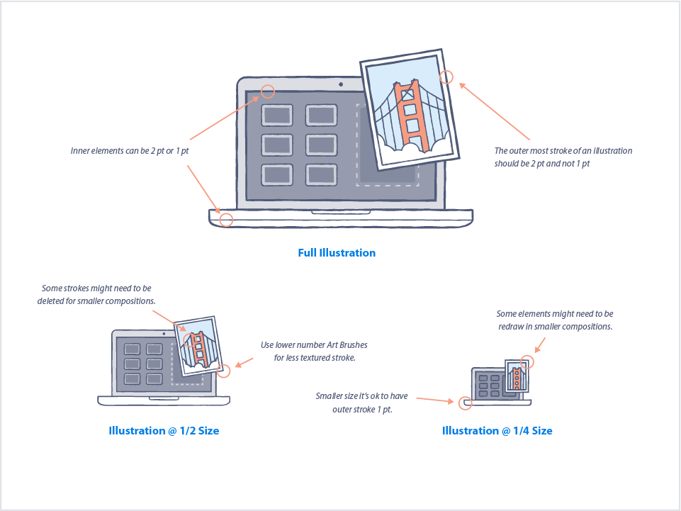
Excerpts from the Putnam era illustration guidelines.
Sourced from Illustrating a More Human Brand.

A fun place for your files to hang out. Image sourced from Illustrating a More Human Brand.
The style itself was really playful, fun, and lightweight, with pastel coloring and wobbly lines reminiscent of pen and ink. There were a lot of anthropomorphized objects. Documents and photos with smiley faces.
If Jon Ying’s illustrations made Dropbox feel like a fun place for users to hang out, the Putnam aesthetic made it feel like a fun place for their files to hang out, like they were overjoyed to be stored in Dropbox. The illustrations were everywhere.
Ryan
You know, any time that we can inject some type of personality from a user experience point of view, that's when we look to illustration to facilitate some of those experiences.
Mark
Despite the growing success of illustration within the company, that early debate about publishing the cockroach never really stopped, it just evolved. The co-founders themselves were split—Arash Ferdowsi championed illustration, while Drew Houston remained skeptical.
Ryan and his team knew that if illustration was to survive continued debate over its very purpose, it had to be adaptable. It couldn’t just be a brand tool, helping to get users in the door. It had to serve the user experience.
Ryan
You start to kind of figure out what works best, and you have to be mindful of the experiences that you’re trying to create. There is very sensitive situations, like for an empty link, where you go back to this link where someone sent you a file, but it’s not there anymore. If you see, you know, like, some document icon with a happy face on it, that could just anger you, that can make you just furious. So it’s being mindful of what people are coming to, and like, how they’re getting there, and what type of experience you want to give to them. What experience are we trying to create and how are we trying to create them? When are we trying to create them?
And if you have some of that structure, like, an illustrator could use kind of some of those restraints to find the best imagery or the best experience or it might be not even having an illustration there.
So that’s where sometimes these guides and stuff could be beneficial, and also not beneficial. If someone’s just relying on a very strict kind of set of goals or requirements for an illustration, like “we put a smiley face on everything,” and then just pisses everyone off. You know, that’s not good.
Mark
Even with a system in place, illustration was never static. For example, when the team realized things were getting a bit too literal—happy documents in happy boxes—they moved towards more conceptual approaches.
Ryan
Again, I think that’s why Dropbox is interesting to see the life of the illustration. How it has grown with the brand and, you know, morphed to do the different things it needed to do at the time of the company. So illustration itself can be nimble. That’s why I tend to think of it as just a different brand asset, essentially. So every once a while, you’ll change your typography or colors, just based on the needs of the company. Illustration’s the same in my mind. It’s built for the specific need, and if the needs change, then let’s change it, too.
Mark
But for all the talk of illustration’s effect on the brand, and illustration as a brand asset, Dropbox made it this far without a formal brand team. That all changed when the company hired Kristen Spilman.
Like Ryan, Kristen was creative from an early age. Though she didn’t necessarily embrace it.
Kristen
Growing up, I fear that I was typecast as the artistic kid, and I fought it for many early years. I always remember my mom trying to put me into ceramics camp or painting this or, you know, studio model that at a very young age. And I was offended that it was so obvious that I was the creative one, and I just really wanted to do the sports camps or whatever else everyone else was doing.
I think that the switch for me actually happened in high school. I had played the flute. When you got to high school, you had to join the marching band if you were going to continue playing an instrument. And that was just it for me, like, I was not going to wear the costume, or the outfit. It’s not even—in my mind, still, it's a costume [laughter]. I was just not gonna put it on. And so I was willing to quit playing the flute in order not to wear those clothes. And in lieu of sticking with the flute, I took art classes, and I loved it. I mean, I’m just a very stubborn person, I guess, and so that showed in early years, and once I finally got into kind of visual fine arts classes, I thrived.
Mark
When Kristen started Boston University as an undergrad, she initially pursued painting. Fine arts. But she found herself disillusioned, unable to see a path forward professionally.
Kristen
As a career it just didn't ever connect. Being a painter was personal. It was, I did what I wanted to do. It was a manner of expression and communication, but I didn't really want to sell that to anyone. I didn't want to talk about it in a way that would be compelling in a gallery environment.
And so my curiosity, you know, had me wandering about the school trying to see what else might be a better fit, and I stumbled upon graphic design. And so taking some initial courses and understanding what typography was, and that letter forms are also an art form that were packed with so much meaning, message, and heritage behind them, I just became fascinated with this new palette and this new toolkit that was naturally and appropriately intended to communicate ideas for other people. There was something that I learned that was inherently social about these form factors that felt far more comfortable for me as a career.
And you know, I didn't grow up with a lot of money and I knew that I needed a job, I needed a career. Going to college the goal was to walk away with opportunity, to build a career for myself. That's really what got me into design, was being, like, a failed painter—or electing to fail at painting.
Mark
That failed painter went on to earn her masters degree in graphic design from the Maryland Institute College of Art in Baltimore. Kristen joined the school’s faculty, and for the next eight years she taught undergraduate design while also working as an Associate Partner at Pentagram, arguably the most prestigious branding and identity firm in the world. When she came to Dropbox’s attention in 2014, it was by way of her former students.
Kristen
And oftentimes recruiters in tech will talk to new hires and say, “Who was influential in your career? Who made an impact? Who really helped you get to where you are?” And my name kept coming up for a couple people. So the recruiters reached out to me, and I just thought, “Oh, this is brilliant. I will have a direct connection to create opportunities for my students if they're interested in going into tech.” And it was quite naive. I had no idea that they were really interested in talking to me.
At the time, being “design first” in tech was in vogue, and people were really trying to understand what that means. And it required a lot of education and exposure and helping people in other disciplines across tech company tech companies understand the role of design. What it means, how you get there, what the process is like. So it was part of my education background that became valuable at Dropbox.
Mark
The company was also in need of Kristen’s extensive branding experience. By 2014, Dropbox had grown from a single cloud storage service to a suite of consumer products, including Carousel, a photo viewing experience, and Mailbox, an innovative email client. New products meant new challenges.
Kristen
And there was a lot of joy in terms of figuring out what the visual language would be, and to set those products up as differentiated within the suite of products themselves, but also cohesive as coming from the same place.
Mark
It’s clear what Dropbox saw in Kristen, but I asked her: What did she see in Dropbox? What convinced her to leave her life in Baltimore and head out west?
Kristen
If there was one short answer to what brought me to Dropbox, it was curiosity. It was clear that something was going on, it was clear that something that new was happening in terms of the surfaces where design was going to be critical.
And I thought, you know, Dropbox just had this suite of products that had the potential to be at the center of how communication and making was going to be transformed with tech. And I wanted to be a part of that.
I don't like having regrets. I've never had regrets in my career, and I think that if I turned down this opportunity, this is one of those things where I would look back in 10 years saying, “Remember when you had that chance to be a part of that industry which was taking on design and it was nascent at the time, and you passed that up?” And so I took a risk and took the job at Dropbox.
Mark
It was, understandably, a transition. She couldn’t rely on the same tools and techniques as she had in the past.
Kristen
I always remember—you know, from my first weeks at Dropbox after leaving Pentagram and teaching—I realized how fortunate I was to be able to rely on typography as a toolkit and a palette within my design vocabulary, because immediately when you move over into tech or brands and products that are more global in nature, language becomes alienating unless it translates.
And so typography, all the sudden, wasn't my go to. Whereas previously I had considered that equivalent to my paint. Anything that I was going to do, I was going to start with looking at typefaces and seeing what form factors and rhythms I would find through those letterforms, and either create work from that as a starting point or literally use those letterforms in everything that I did.
Mark
With language and typography in the back seat, illustration was crucial.
Kristen
Illustration has been a critical part of the palette and tech because of language barriers. The whole adage of “a picture is worth more than a thousand words,” kind of thing, it helps people understand.
Mark
And so while Ryan had set out to upgrade and formalize the illustration aesthetic, Kristen set out to upgrade and formalize the entire brand, as well as the creative team itself.
Kristen
And when I joined the team was tiny. I mean, it was a small, scrappy crew of people. And so when I joined I had two people that I was managing, Ryan Putnam and Zach Graham. There were several other designers and illustrators at the company, but they were on different teams. And our task was to build out that illustration team, which, over the year and a half that I was at Dropbox, became known as “Brand Studio.”
It wasn't all illustrators. It was really important to me that the brand studio was a multi-disciplinary team, so we had copywriters and content strategists and producers and visual designers and illustrators that made up this team that sat in the product design team and was ready to help shape the voice across product and build bridges into marketing as well.
Mark
This particular point really resonated with me. When I started at my current company, Circle, I was hired as a “product designer who can illustrate.” My primary responsibility was the design of our web product, but I was occasionally tasked with creating an icon, an image for a blog post, or a graphic to explain or promote a feature.
As our use of illustration grew, we knew we’d need to define our illustrative brand. That meant collaborating more with Brand Creative, the team of designers, copywriters, and developers dedicated to our brand guidelines, website, social media, and more.
Today, illustration represents the bulk of my responsibilities. And while I’m still on the product design team, I’ve become a sort of product/brand liaison. It’s left me with a bit of an uncertain identity. Where does illustration really belong? Does product drive brand, or does brand drive product?
Kristen
To be completely honest, I think many companies are still trying to figure this out, because obviously the relationship between creative in the product and creative that's a part of marketing campaigns needs to have some sort of harmony and synergy about it.
My career had been built on developing the thing itself. Whether that was a magazine or a book or an exhibition, I was a part of the crafting of that form and that object, not the stories around that object to help people know about it, right? And so it didn't make sense to me that we would be separated from the product team. This was core to the product experience. And that was critical to me. There's no way that it would be successful unless we were sitting with the engineers and the product designers thinking and asking the same questions and understanding what we were building. But we just had a different job, that our job was more front end, to put the face around how these things came together.
Mark
Kristen helped usher in the next phase of illustration at Dropbox. The style went through yet another overhaul, but this time, it was part of a more holistic brand exploration.


Illustration in the Spilman era brand refresh. Finished work on the left by Dominic Flask, and unused sketches by Fanny Luor on the right.
Kristen
As I mentioned before, it was important to me that this wasn't just about illustration. So I also tackled the word mark and the icon and the glyphs and the lockups and the system for future products that might come out of this. So building out a proper brand toolkit that had a voice and tone guide, in addition to guidelines around illustration, and so forth.
Mark
The company had come a long way from pencil sketches and Easter eggs. Thanks to Kristen and her team, illustration was finally understood as a crucial part of the Dropbox identity. The system she built was a solid foundation for future growth.
In 2018, ten years after its debut to the public, Dropbox went public, filing an IPO. But for all the millions of dollars they made for their investors, for the bajillion files they’ve saved and synced over the years, I’d argue that one of their greatest successes was their leadership in illustration. Here’s Ryan again.
Ryan
That's why Dropbox was so great, because it was just this, like, this place that already had that value placed on illustration and design and just, like, this extra kind of value add of delight, or whatever you call it.
It’s nice that Dropbox was an incubator for that, to kind of prove out the brand value. I mean, I'm not sure if they proved out any other business value, but at the very least, [laughter] the brand value of illustration. I think that in that respect, Dropbox definitely had a hand in like making illustration, design, or whatever discipline actually, like, palatable to other companies.
Kristen
Ryan Putnam, to a certain degree, can be credited with creating space for illustration in tech, at least, like, the power and the potential of the role that illustration has. And he is just such an amazingly talented person, and his work shows, and it’s copied left and right.
Mark
It’s true, Dropbox inspired copycats (imitation being the most sincere form of flattery, I suppose). But more importantly, Dropbox inspired a new perspective, a new conversation. They put illustration at the heart of brand and user experience in a way that really hadn’t been done before. They demonstrated that “serious” and “dependable” didn’t have to mean “inhuman.” It’s okay to show some personality, to experiment, to surprise, to delight.
And as for all those internal battles over illustration’s very purpose and place? In the long run, they only strengthened its position. Debate forced the creative team to systematize, to professionalize, to prove that illustration wasn’t just a pretty coat of paint, but rather a fundamental tool for visual communication. A unique way create meaningful emotional connections with customers. And if there’s value in illustration, there’s value in illustrators.
Ryan
I really want to champion illustration, giving power to illustrators to have a voice at the table and get, you know, compensated for it too. The stuff we make, there’s a lot of value in it, and it’s like, hard, and we’re trained for a while to produce this kind of work. And especially if you’re at the spectrum of "design illustrator,” you have to be kind of understanding of UX, UI, product in general, and you have to be able to work within that context. Plus, add on that that you can illustrate and you can produce imagery, like, in this way. So, I mean, I truly believe that it’s like a highly valued kind of skill set. And I think it should be highlighted that it is, like, a very kind of cool area of expertise.
Mark
The company’s influence can also be measured by the contributions of its alumns. After leaving Dropbox, Ryan started Putnam Studio, a small firm dedicated to crafting illustrated brands. Kristen Spilman led an illustration overhaul at Facebook, and Alice Lee, one of the earliest Dropbox illustrators, has gone on to create iconic work for Slack and Wealthfront.
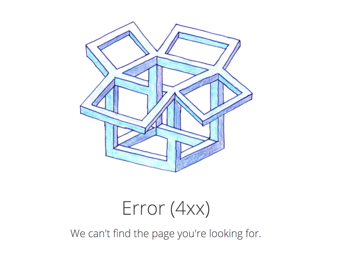
And well after that whole crew left, Dropbox continued to push forward. In late 2017, the company revealed a dramatic redesign of its entire brand, a complete departure from everything that came before.
Images sourced from the Brand New review of Dropbox’s new 2017 brand
The new brand uses contrast and juxtaposition to represent the enormous variety in Dropbox’s user base, from creatives to scientists to startups to everyday folks. The brand’s type family, Sharp Grotesk, has over 250 different fonts. The colors are off the wall. And illustration? There’s not a whiff of doubt about its power or position. It’s bolder than ever: richly textural, extraordinarily expressive. Here’s how the Dropbox brand website describes their approach:
We’ve used illustration to bring life to our product and brand since Dropbox started over 10 years ago. Our new illustration style picks up where our earliest style—loose, handmade, witty—left off. We create rough sketches using graphite, then pair them with colorful, abstract shapes to bring the creative process to life. Our style is inspired by the moment when you first have an idea, and serves as a reminder that the “canvas is only blank until you make the first mark.”
With this new brand, Dropbox is no longer positioning itself as just a place to store your stuff. After all, it’s 2018. The cloud is more familiar to us now, and that means the brand is free to evoke new ideas. The company wants to align itself with creativity instead of utility.
A decade ago, Jon Ying drew a stick figure chasing a cockroach, and it ignited a debate within Dropbox that continued for years to come.
Today, that same conversation would go very differently. It’s part of the toolset now, alongside typography, color, photography, and copywriting. A company may debate and iterate on what kind of illustration is right for them, but to argue that it doesn’t belong at all? That bug’s been squashed.
[Theme music]
Mark
How to Draw a Startup is written, produced, edited, and scored by me, Mark Grambau.
You can subscribe to the show via Apple Podcasts, Spotify, or wherever fine podcasts are found. And while you’re there, please leave a rating or a review! I would love to hear your feedback, and it helps others discover the show.
You can also find the show on Twitter and Instagram at @drawastartup, or on the web at howtodrawastartup.show (.com works too, but .show is just way more fun). Check it out for helpful links and illustrations, more info about my guests, and full transcripts of each episode.
Of course, I’d like to thank Kristen Spilman and Ryan Putnam for sharing their stories.
Additional thanks to Bobbi Pinkston, Casey Berry, Jayne Hetherington, Michael Perrone, and my mom, Linda Bloch, for their insightful feedback as I edited this first episode.
Extra special thanks to my wife, Melissa Chao, who has been enormously patient during this show’s many, many months of production.
I referred to a number of sources for this episode, but none more than Illustrating a More Human Brand: The history of Dropbox brand illustration. It’s a fantastic two-part story written by Michael Jeter, associate creative director and illustration lead at Dropbox. It’s chock full of great details, anecdotes, and of course, illustrations. I’ve included links to both parts of the story in the show notes. Go check it out, really. It’s a great read.
On the next episode of How to Draw a Startup, it’s time to talk process.
• • •
Ryan
People think about stuff differently, but they all tend to think about the success of their company the same though, and that’s usually based in some set of goals.
• • •
Hannah
I’ve had a client who was like, “We’re Bruce Springsteen, we’re rock and roll, we’re, like, out there!” And I was like, “Great, you want an out there style. Like, here you go.” And I, like, pitch a mood board, and they’re like, “Just kidding, we’re not rock and roll. We are a data company. I’m so sorry.”
Mark
We’re maybe elevator jazz. Let’s, let’s pull it back a bit.
Hannah
[laughter] Exactly! Yeah.
• • •
Kevin Walker
And then Kristen started presenting it up the ladder, and it seemed to really resonate. And she turned back and she said, “I think, I think we’re a go. Let’s do this!”
• • •
Mark
Step 2 is coming January 3rd. Thanks for listening!
Disclaimer:
How to Draw a Startup is not affiliated with or otherwise sponsored by Dropbox, Inc.