There’s a big difference between a “style” and a “system.” One is fragile, the other is flexible. One is pretty, the other is proven. This week, we examine the end of the Putnam Process. How do you ensure the successful launch and legacy of an illustrated brand?

Show notes
Today’s guests:
Transcript
Mark Grambau
Previously on “How to Draw a Startup,” we were introduced to the Putnam Process, a method for developing illustrated brands:
Phase one: the Brand Audit, to identify opportunities for illustration and establish goals.
Phase two: the Visual Landscape, to explore how different visual styles may address those goals.
Phase three: Style Construction, to nail down a direction.
Phase four: the Illustration Library, to follow and build upon that direction, creating a vast collection of illustrations.
And finally, phase five: Illustration Legacy, creating documentation and resources so that others can adopt and expand the system.
We left off with a dramatic cliffhanger—or as much of a dramatic cliffhanger as you get in a podcast about tech illustration. We defined goals, explored the visual landscape, and got buy-in from our client on a style to pursue. But, we learned, there’s a big difference between a “style” and a “system.” A style is untested. A style is fragile, an attractive, yet potentially shallow layer that might fall apart in real-world use. A system, on the other hand, is robust. It’s deep—and deeply flexible—built to adapt, to grow, to last. We’ve got some work ahead of us.
In today’s episode, we tackle the end of the Putnam Process: refining the style in order to define the system, building out a library of assets, documenting the choices we’ve made along the way, and, in the spirit of dramatic cliffhangers, I’m throwing in one additional step. Another step‽ What could it be? Only one way to find out.
My name is Mark Grambau, and this is How to Draw a Startup: A step-by-step guide to illustration in tech.
[Theme music]
Mark
Step 3: Design, seal, deliver.
Per the patented Putnam Process, it’s time for phase four: the “Illustration Library.” Here’s Ryan:
Ryan Putnam
This is like a point in the process that is not necessarily set in stone and different for different customers. That library of illustrations could be a predetermined set of illustrations, it could be, like, an onboarding project where we need like five or six big illustrations, or it could be more something of, like, “we need to generally think about these type of concepts” or “these are the type of things that we run into, so let's build out, you know, a library of stuff based around, roughly, these concepts.”
So we'll build those out and kind of pressure test the style itself to see where the holes are, like, what works, what's not working.

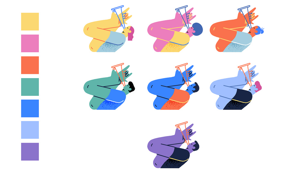
An example of the “Illustration Library” phase, as seen in Putnam Studio’s work for Operator. Sourced from Illustration Identities Are Our Thing, by Ryan Putnam.
Mark
In our last episode we met Kevin Walker, creative director at Buck, who helped reinvent illustration at Facebook. I asked Kevin if his team was given a specific set of illustrations to tackle or if it was more open-ended.
Kevin Walker
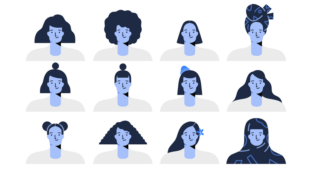
There was loosely a list. It was, it was more by categories. We need to know what it feels like when we need to present outdoors, indoors, nature, city. We need to know what it feels like when we are talking about tech and we need to show products. We need to know what these, you know, characters feel like if they are sad, or happy, you know? So like, suddenly, this tree of stuff you need to realize and at least need to give guidance on becomes massive. And that extended down into things like objects, like, what do animals look like? What do plants look like? What do vehicles look like?
So you start to sort of architect the system, you start to basically bucket everything, start working on it, but also constantly checking it to make sure that it still can assemble, that it can actually still exist as compositions and message things.
Mark
Kevin’s suggestion for developing and pressure testing a system that needs to scale so dramatically? It’s speed. Constant, rapid iteration.
Kevin
I think that it's best to be moving quickly and be trying to move into all these different corners, all these different places that illustration may work or need to be and trying it out.
And I think that that sort of speed… and you know, I think we were hustling, making sure that it worked everywhere, because we wanted to make sure we got out there, we knew what it felt like it was billboard size, we knew what it felt like if it was on your phone, we knew what it felt like when it needed to walk you through a new experience, all of that stuff. And so we could go back and then sort of tweak core stuff.
So moving fast in the beginning and really doing a ton of iterations. I was joking while we were working on the style guide that I felt like we were doing an illustrated Moby Dick, like, three times over.
It’s just move quick and get a ton of work out so you can really make sure it works.


Mark
Every hole you poke is a hole you can patch. Every icon or pattern that fails to scale is an opportunity to strengthen the system. With each iteration, the changes become progressively smaller and subtler until things are settled into place. It’s time for the fifth and final phase of the Putnam Process: the “Illustration Legacy.”
Just like a traditional brand guide, if you want the folks who come after you to respect the system you’ve built, you have to lay out the rules. You need to document your choices and provide the necessary resources to work within the system. Illustrator and designer Hannah Swann starts thinking about this early on in the process.
Hannah Swann
I love the documentation process. I think it's a really great way to use my Type A brain. I think it's a really wonderful exercise in just sort of, like, demystifying illustration. And I've honed my process to while I’m building out, like, this library of illustrations, start to find those consistencies, like, as soon as possible.
And there's certain things that you can start to right off the bat like color palette, shape language, depending on if you're using, like, strokes or fills or a combination. Just sort of starting to apply a loose system of those as you build those out.
And then in the documentation you can just sort of, like, write all those out.
I mean, I guess, like, the documentation, I’ve found, is really fun and easy for me because I've already… I’ve already had that mindset while I've been creating all of this, that this needs to be something that I can, like, discuss to another person.
Mark
It's less about creating something new as it is writing down the story you’ve already written in your head.
Hannah
Exactly.

A page from Putnam Studio’s documentation for Credit Karma, an example of phase five, the “Illustration Legacy.” Sourced from Illustration Identities Are Our Thing, by Ryan Putnam.
Mark
In addition to documenting the system’s look and feel, it’s common to create a set of resources like patterns, textures, and digital brushes, elements another illustrator can pick up to easily work in the style without needing to work from scratch. That said, just because you can doesn’t mean you should. Rules, regulations, and pre-made resources are helpful right up until they become handcuffs. Being too prescriptive about execution can come across to your colleagues as “I don’t trust you.”
When Ryan Putnam reflects on the work he did at Dropbox, he believes he may have gone too far. Today, he looks for a more balanced, trusting approach.
Ryan
I think some of the stuff, the brush set I made for Dropbox was maybe a little overkill, and it was maybe a little too specific of how to create stuff. Whereas some of the other kind of systems I've built out, they were there more like “Build it, making it look like this; we trust you, illustrator. You could do this the best way you think possible.” You know, putting some trust in the designers and illustrators that produce this stuff.
So I think it's stepping away a little bit more on how specifically to, like, create these illustrations. It's just, like, giving them the compositional kind of structure to build this. “This is how we use texture. You create it any way you want. We do have some assets here that you can use to make it quicker, but like, if you see another need, another way to build this texture, given the reasons why we use it, go for it.” Because that's where, like, the illustration could grow into its own. That's, you know, where these other illustrators could put their own take on it. So, like, I've tried to step back a little bit about being so specific about things.
Mark
Kevin Walker agrees. There’s a real risk of stifling creativity.
Kevin
I mean, the challenge in all of them is to make sure—and this is the challenge with the idea of creating a style in general—is that it doesn't start to dry up, that it doesn't start to feel rigid, and also… “vectory?” I mean, vectory’s not really the right word, but do you know what I mean? There's this idea that illustration, when it gets kind of scrubbed too clean, just winds up losing all of its personality.
I mean, illustration at its core is “my thought to my hand to your eye to your thought.” It's writing by another mean in a way that that film and photography can't do. And when that gets really clean, you know, really anti-septic in its actual visual representation, that communication between… from me to you, it starts to lose some of its magic. Like, there is something about looseness or rawness or texture or tactile-ness that you want to make sure you keep. And there's going to be this fight because you're creating a guide and a style and you're trying to teach many people to do one thing, but you still need to keep this sense of, sort of, the rawness of illustration.


There is no shortage of energy and texture in the “Alegria” illustration system.
Mark
On top of all that, what about the time aspect? The time to produce and the time to read. The world’s most comprehensive style guide will have an audience of zero. This point was driven home to me by Stewart Scott-Curran. Today, Stewart is the Director of Brand Communications at Dribbble, the portfolio site/social network for the creative community. He’s had a long career of design leadership at major brands like Nike, Coca-Cola, and CNN, and there’s not much that giant companies love more than equally giant brand manuals.
Stewart Scott-Curran
At Nike and Coca Cola you had entire teams of people who would just work on this stuff constantly. I remember getting a style guide for Coca Cola when I was working with an agency here in San Francisco called Turner Duckworth. They kind of delivered us, like, the new version of the Coca Cola brand style guide, and it was 350 pages long. And, you know, like, you can understand why that's the case. It's multiple use cases, multiple languages, you know, all of that stuff. But it's just, like, pretty overwhelming. And I think, like, I'm always wary of spending too much time doing that stuff. And whoever read all of those 350 pages? Like, nobody.
Mark
Stewart’s move to Dribbble is relatively recent. When I spoke to him in mid-2018, he was in his third year as the Brand Design Director at Intercom, a tech company that makes tools to help online businesses connect with their customers.
Under Stewart’s leadership, the Intercom Brand Studio took documentation seriously, but never forgot what they were really there to do. Note that the following was about the overall Intercom brand system, but the principle applies to illustration documentation as well.
Stewart
You know, we have one or two people on the team who generally lead that project. And they make sure that all of our documentation is pretty robust and kept up to date.
And I think we intentionally keep our style guide fairly light. You know, like, we don't want to be updating that every with every single new example of what we've done. I think, like, what we try and do is build some pretty directive principles there, and then from there it's kind of like open to individual teams, how they want to take those and use those.
We have this principle of, like, “just enough process.” Just enough to kind of keep things looking consistent, but not too much that you're constantly working on that, rather than doing the actual work.
Mark
Sometimes the best way to learn that lesson is on the job. In the last episode of this show, we met illustrator and designer Meg Robichaud. Meg joined Shopify in 2016 with a clear mission: to lead a comprehensive overhaul of their illustration system. But as time went on, Meg’s understanding of what “mission accomplished” would look like began to evolve.
Meg Robichaud
I definitely, when I went into it, thought success was going to be these big, long, beautiful, neurotic guidelines of, like, “here is how you illustrate this way.” And, like, that was my big goal, and, I thought, the most useful thing for me to be doing. Over the two years, I think, making a guideline on how to illustrate like me is probably, like, the least useful thing for me to do with my time.
And so I think, by the end of it, I would consider success having built the right resources. And also having designers on both marketing and product design being excited to use your work as a resource. I mean, that's my biggest mark of success, for sure.
Mark
Okay, so let’s say you’ve struck that perfect balance of descriptive, but not too prescriptive. You’ve outlined every color and shape and provided some helpful resources, while still leaving room for future illustrators to explore and expand the style. Awesome! A+.
But an illustration system is more than just look and feel. It’s about concept. It’s about metaphors. It’s about what to use and why and when. How do you document all the tiny little choices you made along the way, the subtle notions that inform every illustration? Here’s Hannah Swann:
Hannah
The part that can be hard sometimes is talking about content or concept. I think writing the, like, visual rules are always pretty fun and easy and straightforward. But in terms of content, like, what is the tone and the mood, I think that's always way harder. And that's where you can kind of get yourself stuck.
Mark
Meg Robichaud has given this a great deal of thought.
Meg
So I've tried a quite a few ways to document this. And I think—having not like completely solved it, so these are still kind of just ideas—but my greatest source of inspiration are always content guidelines, not design guidelines. Like, how you write is probably how I will tell you to illustrate.
But one of the ways I think that has been more successful is matching how far you can take the metaphor to the tone of voice or the situation. So we use very plain language when we're telling you a negative or neutral event, and we do the same thing with illustration. We draw the thing very literally for a negative or neutral event.
Mark
To me, approaching illustration documentation like a voice and tone guide for writers feels right on the money. I’ve always felt a certain creative kinship with copywriters. We’re both linguists, storytellers. Prose and paint are just two sides of the same coin.
Meg has also drawn inspiration from another literary avenue.
Meg
And I have also tried before, although with limited success, to map it to story arcs.
The story arc has been written about for, I don't know how long, but like, we're pretty sure that we've got it figured out. Like, there's a rising action, there's a climax, there's a conclusion.
So if it's kind of a more rising action, then we can use more more colors or more, like, we used sparkles a lot, like that kind of thing. Like more energy or more exaggerated proportions if it’s, like, an exciting moment, compared to if we're trying to be more calm, like, this is maybe a stressful situation, although not a negative situation, then we would use less exaggerated proportions. We don't want to slow you down and have you figure it out so much, so we'll be more literal.
Mark
Until now, we’ve mostly heard about Meg’s experiences at Shopify, but in 2018, she left the company to join Lyft. That transition has provided a great example of how illustration can adapt its tone and complexity based on context.
Shopify makes e-commerce software, tools for running an online or brick and mortar store. A store owner might work in the Shopify interface for hours at a time—entering inventory, managing orders—and they’re probably doing so on a medium to large display, a laptop or desktop.
Lyft, on the other hand, is highly transactional—get in, book a ride, get out—and it’s all on your phone, a relatively small screen.
Meg
I spent a lot of time at Shopify trying to convince people that they could use illustration, and I spend a lot of time at Lyft trying to convince people that they can’t use illustration. Which is… it’s not a position I’m used to being in!
It’s this really powerful tool, and there’s so much space for it to tell these really elaborate stories on Shopify—elaborate, but that you can still get pretty quickly because you have time to digest what’s happening. And, like, the small screens, I find, if we start putting them in places that are distracting and that it should be just text, it’s just going to teach everyone to ignore them, and then we won’t be able to use them at all.
But I do also find we need to be more literal because, again, it’s so small and people are moving through it much faster. You know, you’re on Shopify and you have sat down for the evening to put in your orders, and you’re okay with things taking a little bit of extra time.
But if you’re trying to order a car and you’re late and we put an illustration there instead of just straight up text, or you’re trying to understand what the hell we drew, you’re just going to be frustrated.
Mark
As I spoke to Meg, I was reminded of Fogg’s Behavioral Model, a system created by the founder of Stanford University’s Behavior Design Lab, Dr. BJ Fogg. It’s a tool I’ve used on user experience projects. In a nutshell, the Fogg model says that for a user to take action, you’ve got to provide them with a prompt when they are motivated and able.
If a user is motivated but the task is beyond their ability, there’s no prompt that’ll get them to complete the task. On the other hand, if it’s easy but they just don’t care, same problem.
If a user isn’t doing a task you’ve laid out for them—signing up, booking a ride, referring a friend—you can ask yourself: “Are they properly motivated? Is there a reward in it for them? Am I putting up roadblocks, making it harder than it needs to be?”
Using proven structures like content guidelines, story arcs, and the Fogg Behavioral Model gives us a baseline for evaluating illustration as a functional piece of visual communication. Art with a job to do. It helps us understand and define why and how illustration adapts to different situations.
This kind of contextual adaptation is in full swing over at Airbnb.
Jennifer Hom
Hi, my name is Jennifer Hom. I am the illustration manager for product at Airbnb and I have been working in tech illustration for about a decade.
Mark
Jennifer’s decade in tech is full of some really great stories, but I’m going to pause and save her biography for future episodes. Today, I want to skip right ahead to some shiny pearls of illustration wisdom.
Jennifer
Illustration lives in product on a sliding scale. So Airbnb approaches illustration as a core part of its brand and, by extension, it’s a way of communication It’s how we’re talking to our users. It’s basically part of our personality. So there’s the part where you define the aesthetics, how it looks, and there is also the part where you define how you’re actually picking your subject matter.
On one end of the spectrum, you have a very direct message. Those are the icons. Those are small, those are almost always literal—or it’s, like, a very light touch of metaphor—but it’s action oriented and it’s clear, it’s direct, and it’s simple, and it gets out of your way. It helps you along, but then it steps away afterward.
In the middle of the spectrum within product is, like, the large and medium spot illustrations. Those are there to, like, lighten the cognitive load of a complex concept, and they’re to show a little bit more personality, some emotion. Like, if we’re trying to convey trust and safety, which is a big subject matter for Airbnb because we’re connecting strangers, we would use a larger illustration to show, like, “Oh, this is how our customer service experience works, and we are here to listen to you whenever there’s a problem, should that arise.” So they’re a little bit larger. They have to be more communicative and they have to be a little bit more editorial. That’s also where you can bring in some personality. So visually, it becomes more complex. Editorially, you start bringing some light metaphor, you start bringing in some empathy, some emotion.
And then all the way on the other side of the spectrum opposite from icons is celebratory and hero illustrations, and those are for making sure that the user feels acknowledged and that they feel like they accomplished something.
For example, we sent out emails to all the hosts this past Summer, this past Spring, who became “Superhosts.” So that’s—I think it’s, like, the top five or so percent of hosts on Airbnb. They’re just, like, particularly great. We congratulate them with status of, like, “You’re the upper echelon of hosts.” So for that we sent out emails with this big hero illustration that was full bleed, it was animated. My closest coworker, Salih Abdul-Karim, he did the animation for me. But it was also very metaphorical. It was very editorial. Instead of being very literal, on the icon side, we took the opposite approach and we had this animation of a flower that was growing and blossoming after watering and blooming into this beautiful object at the end. And that was to show that you have spent all this time nurturing your business and growing your home and your listing, and it became this this beautiful thing that you should be proud of.
Complex, beautiful illustration by Jennifer Hom congratulating Airbnb Superhosts. Brought to life by Salih Abdul-Karim. Embedded from Jennifer’s Instagram.


So our language for illustration at Airbnb is adjustable. It is context appropriate, and it’s never one aesthetic and one note from one case to another. It slides across the scale so that we’re always having the same overall visual sensibility, but we adjust it so that it’s appropriate. We can be direct and we can also be metaphorical and celebratory, but it’s always in the appropriate place.
Mark
That concept of a “sliding scale” can also be put to use outside the product. Intercom, for example, modifies its illustrative voice for different kinds of brand communication, and it’s not just about changing tone or visual complexity. Context can determine how strictly the team applies their own standards.
Here’s Stewart Scott-Curran again:
Stewart
We think about that on a sliding scale which you can dial up and down as you see fit.
The visual expression on the homepage or the product pages or on the marketing site in general is probably always going to be, like, the most conservative version of that. You know, that's where you're trying to get potential customers attention. You're trying to tell them what you do. You want to explain how we can help them. So it’s a very kind of, like, targeted message. And so that’s, that’s probably going to be, like, the simplest execution.
You know, as exemplified by the blog, that’s somewhere where you can turn up the volume a little bit more. You know, you can have a little bit more variety. You can take a few more risks. You can go a little bit more abstract, for example.
And then, maybe at the other side of the scale, there's maybe some of the the one-off projects we do, some of the microsite work we do, the events space, for example. That's somewhere where you can really kind of push the work as far as you possibly can.
Mark
Yeah, you have freedom to sort of stray outside of the brand.
Stewart
Exactly, exactly. And so that’s, like, the sliding scale that that we think of. And whenever we start working on new project, we're thinking about ,“where on the scale does this land?” And that really helps you anchor it in something that makes sense. And, you know, you're always kind of, you know, pushing the envelope just enough, but never too far.
Mark
So finally, you’ve made your system—defined look, feel, concept, and context—all within reason, of course. The Putnam Process ends with a handoff.
Ryan
The thing that I’m still struggling with sometimes is, like, off-boarding the stuff onto other illustrators or designers. There’s been some…you know, sometimes it goes well, sometimes there needs to be a lot more off-boarding than just throwing them a style guide, like, “Here you go,” you know, “take off and do it.” Because that’s where you find more holes or you start to do testing of some of this.
I’ve worked for a couple companies where we built out an illustration style and then we test it, and it’s, like, the photographs do test better. And it makes complete sense, so we have to re-review on how we approach the illustration itself. We’re basing our priorities and stuff based off of not necessarily data, but just kind of like, intuition. And, like, it can morph. I guess what I’m saying is, like, off-boarding is hard because it just changes. And being a freelancer vs. working in-house, there’s definitely pluses and negatives for the person producing the work and for the company itself.
Mark
Just because the system is built and well-defined doesn’t mean it will get used—or used properly.
Every creative professional who’s ever freelanced or worked in an agency has plenty of war stories about delivering a perfect gem to a client, only to see a mangled mess when the project went live. It’s the curse of consulting. Handoff means the work is quite literally out of your hands.
But it’s not the only way. The Putnam Process ends at handoff because it was developed by and for an illustration agency, and as we discussed in the last episode, processes can differ when you’re working in-house at a product company. Being on-staff affords you the opportunity to guide your work from concept to launch and beyond.
That’s why I’ve added phase six: “Implementation.”
Actually deploying a whole new set of illustrations across a company and its products comes with its own set of challenges. In Shopify’s case, the new illustration system ran into a common dilemma: How do you replace the engine while the plane’s still in the air?
Meg
We really struggled with it because Shopify is massive. But we were also trying to use our time effectively. Should we try and do everything and then roll it out all at once as this big reveal? Should we go from just the most critical pages and try and get to the other ones as we can? Or do we go from the outside in so that maybe you might catch one of the new illustrations, but you probably statistically won’t until they are all there.

Just some of the seemingly endless empty states Meg and her team produced at Shopify. How do you roll all this out?
It’s really challenging, I think, when you have especially, like, two such different illustration styles. If someone stumbles upon one, it makes that part look really neglected, and it makes our our product look unpolished. But we make a lot of our decisions on the illustration team based on number of views and, like, is this really the most effective use of our time? Because our time is so limited and only 2% of our users are going to see it, maybe we’re okay with it feeling a little bit broken here and there.
I really want to fight for both sides of the argument. We went back and forth on it a bunch, but we ended up just, I think, removing all the illustrations and then adding them as we could.
Mark
When it comes to implementing the work, there’s no right or wrong answer. Each team’s needs and priorities will be a little bit different. And, for that matter, there’s no right or wrong answer about working in-house or as a consultant. Great illustration systems can come from both angles, as demonstrated by the incredible work my guests have produced for Facebook, Dropbox, Intercom, Credit Karma, and Airbnb.
The common thread behind all that work was a steady, methodical approach, a blend of art and science. The exact process varied, sure, they didn’t all follow a particular five phase system. But in every case there were illustrators and designers and art directors partnering with their clients, working together to determine goals, establish common language, explore styles, develop and document a system, and ensure a successful launch.
I began the last episode with a warning that we have to stay on our toes, and never take illustration’s place in tech for granted. I believe process is central to that effort. It naturally aligns our work with design, copywriting, content strategy, and product strategy.
If Dropbox helped illustration get in the door, it’s process that earned it a seat at the table.
[Theme music]
Mark
How to Draw a Startup is written, produced, edited, and scored by me, Mark Grambau.
You can subscribe to the show via Apple Podcasts, Spotify, or wherever fine podcasts are found. And while you’re there, please leave a rating or a review!
I’m especially curious this week: if you work in this field, how does your process differ from what you heard in these last two episodes? Do you have any pro tips for managing client feedback, landing on a style, or documenting a system? Let me know on Twitter or Instagram at @drawastartup.
For links, illustrations, guest information, and full transcripts of each episode, check out howtodrawastartup.show.
Of course, I’d like to give my sincere thanks this week to Jennifer Hom, Ryan Putnam, Meg Robichaud, Stewart Scott-Curran, Hannah Swann, and Kevin Walker.
Neither my guests nor I speak on behalf of our respective employers.
On the next episode of How to Draw a Startup, if you’re going to use illustration to humanize, you might need to draw some humans.
• • •
Jennifer
And I think it was her personal preference to never show people because I think she thought that, like, drawings of people were a little bit uncanny, and she didn’t like to see them. Her preference forced us to think more holistically about our subject matters.
Hannah
That’s the only situation where people actually do push back. I mean, it really speaks to a level of awareness that people have in general, but the drawing makes them uncomfortable. And I'm like, okay, so therefore, like, you know, the person this is representing would make you uncomfortable.
If you're not familiar with this representation, that's not because this person doesn't exist. It’s because there's so little representation.
• • •
Mark
Step 4 arrives on January 31st. Thanks for listening!